Science visualization trends of 2021
Posted by Helena Jambor, on 10 January 2022
Reviewing a year of Data Visualizations
At the end of the year people take stock and reminisce. This also applies to data visualization scientists, who like to review the best visualizations of 2021. I enjoy Maarten Lambrechts summary of all the “Best of 2021” posts [note added: by now this post is included in his list!].
While musing whether to keep or toss my Nature print issues (still undecided!), I browsed through all the science visualizations of 2021. Well, I mainly checked the biology and medicine figures as I really do not understand enough of physics to comment on their charts and plots. Some visualizations and themes really stood out to me – so I decided to summarize the top 10 science visualization trends of 2021 for you.
[Notes: (1) all photos show anonymous excerpts for educational purposes from Nature articles 2021. (2) because of technical difficulties this article was already posted on my personal site.]
- Viva viridis!
The viridis color-scheme is now omnipresent. Viridis was developed by Stefan van der Walt and Nathaniel Smith in 2015 as the default sequential color map for matplotlib. Their goal was to create a color scheme in which color changes are perceptually uniform, and to replace the non-linear Jet/Rainbow-color schemes used previously for sequential data.
Viridis quickly gained popularity as we can see in the many examples below. By now viridis is however no longer only used for sequential data. Instead we also see it being applied to diverging and categorical data, which may be not exactly ideal at times. But for now, let’s celebrate the end of rainbow color schemes!
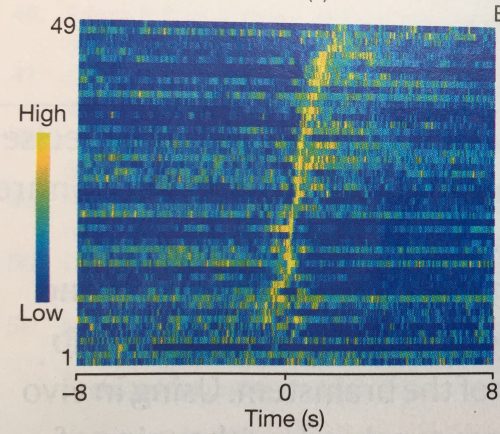

Charts with viridis color-scheme colors
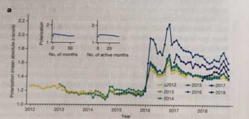
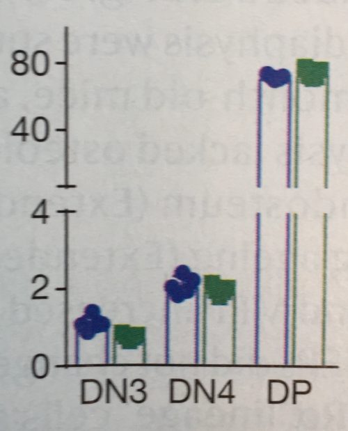
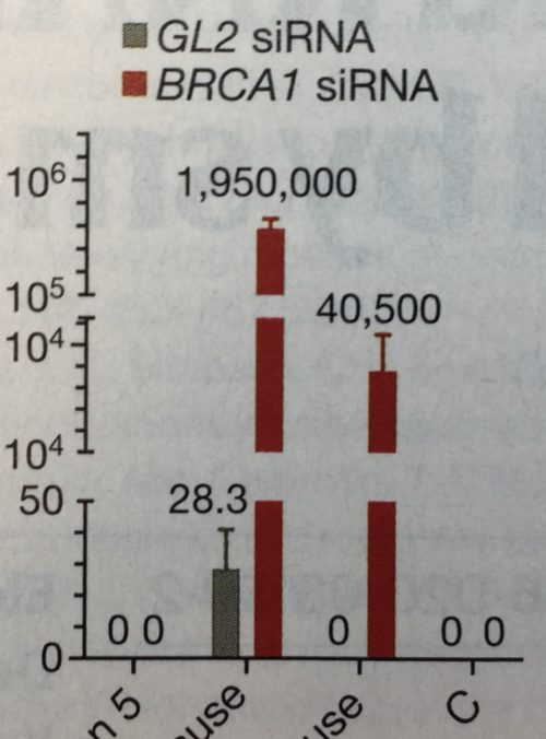
2. Still trending: axis breaks
Yes, axis breaks, necessary or not, are unfortunately still a thing in 2021. And so far, no end in sight. Every time I teach a Data Viz Course, I challenge the students that all axis breaks are avoidable – I have yet to see one where the break really was necessary. Send me yours!
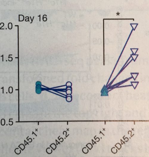
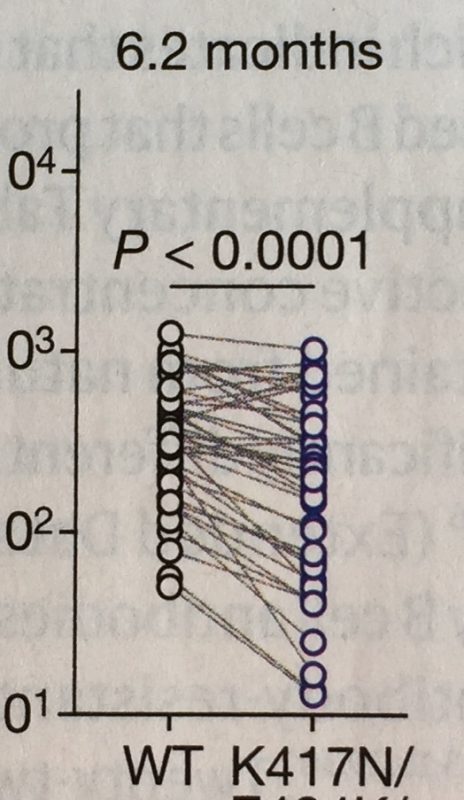
3. Hello slope-charts
In 2016 the #BarBarChart initiative called for a ban of bar charts for data distributions. They were successful and I have not any in 2021. At that time, Tracey Weissgerber published a notable paper encouraging the use of a slope chart for dependent observations. It seems the science world listened again: numerous papers now use slope charts to illustrate dependent measurements of specimens, for example mice before and after treatment, responders and non-responders in cohorts etc.

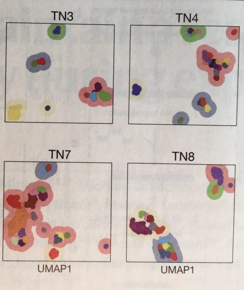
4. tSNE, UMAP, PCA
There don’t seem to be any papers that don’t have at least one dimension reduction plot. t-SNE, UMAP and PCA are omnipresent. These plots are however rarely explained in articles and figure legends, and I suspect even more rarely understood by audiences. In my courses participants are often not familiar with them – not surprising given that they are a recent addition in statistics and still heavily researched in the vis community! To educate your students refer them to these resources from Claus O. Wilke and StatQuest.
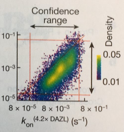
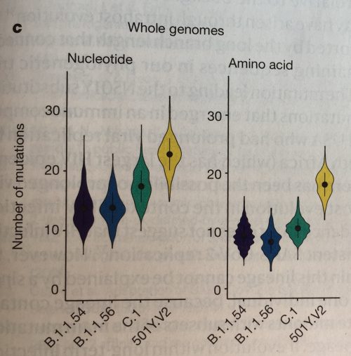
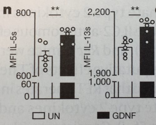
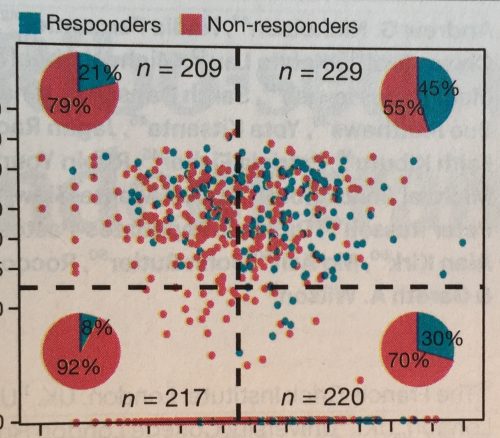
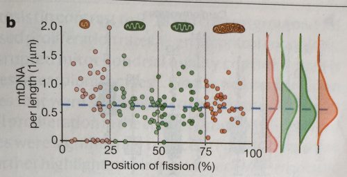
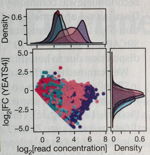
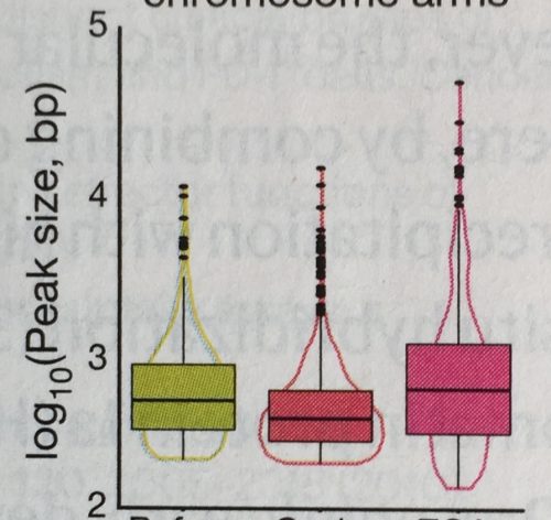
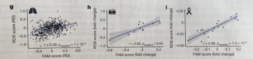
5. Mixing charts
A big fashion trend of 2021 was mixing styles and patterns, and it seems this did spill over to the visualization world. Researchers have become quite experimental with mixing chart types (see also earlier post). I’ve seen a number of scatter plots showing the data distribution summarized along each axis: above for the x-axis and left for the y-axis. I’ve also seen pie charts summarizing the quadrants of a scatter-plot, charts mixing violin and box-plots, of course box-plots with data points, and many more.
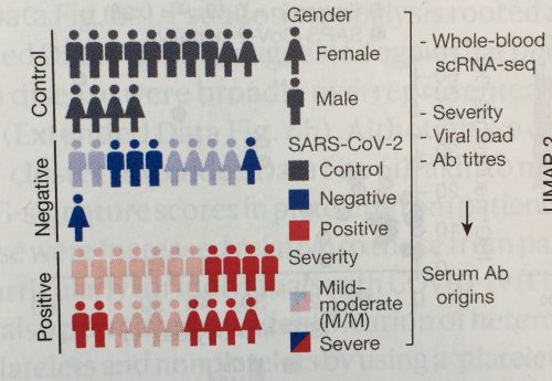
6. Pictograms
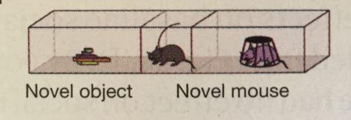
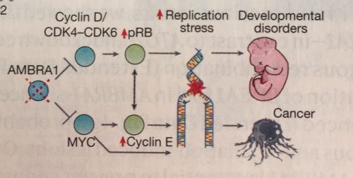
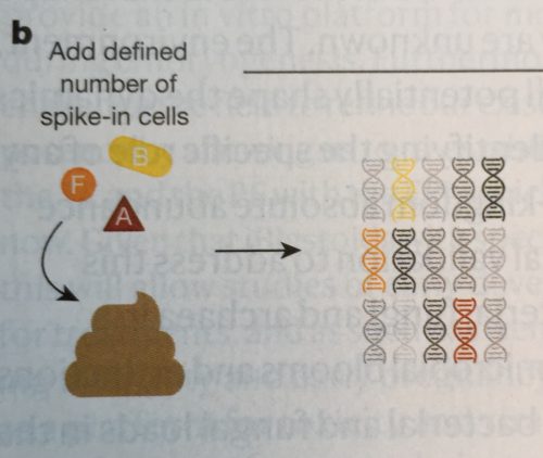
Often novel insights come from a new methodological approach. To familiarize audiences with a new method, papers now regularly include a sketch of the experimental procedure. And, good news, these have begun to look rather nice and clear, whether it’s a stool preparation method, an approach stem cell differentiation, or for a mouse neurobiology set-up.
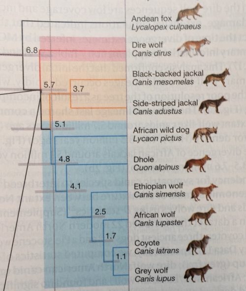
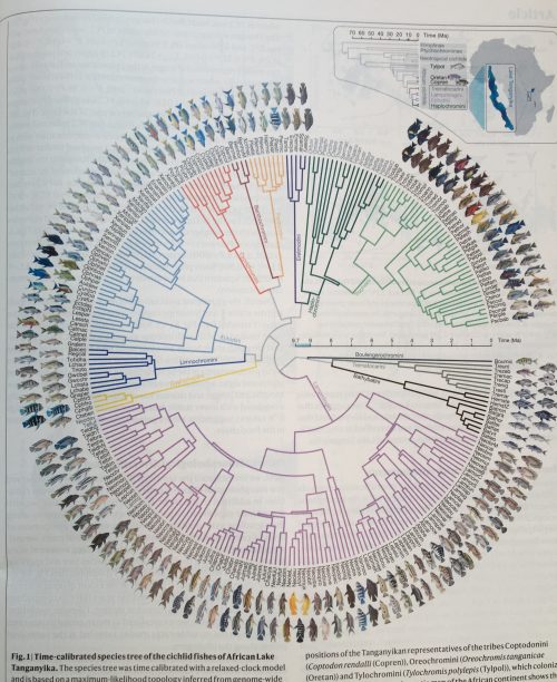
7. Pictograms for labeling
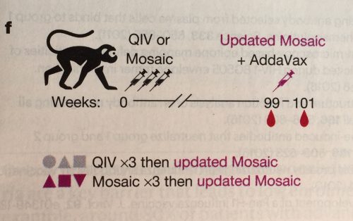
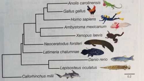
Pictograms are not only used for explaining procedures, but also often help to quickly orient audiences. Pictograms are for example used instead of text: I’ve seen pictograms as a title, pictogram to name a leaf in a phylogenetic tree, or even a pictogram chart. Overall pictograms seem to be most popular in mouse molecular genetics and evolutionary biology. Go figure.
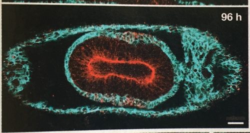
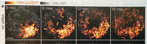
8. Images now come with scale bars!
Scale bars in images are apparently here to stay. A few years ago, I had noticed that scale information was quite often missing in scientific images, even in high profile journals. Eventually this observation prompted a collaborative project to systematically screen the quality of image data in publications.
This year the tide has definitely shifted. Except for a few cases, scale bars are now visibly placed on all images; even in plant and histology images, two fields so far quite notorious for omitting scale information.
9. Colors in images: still problematic
Despite many recent efforts, most recently a technology feature in nature feat. your truly, no end is in sight for images that generously mix red and green, making it illegible for many color-blind people. In addition, often images that show false-color scales do not come with a legend explaining the color intensities.
A glimpse of hope: I’ve seen a color legend once this year (still without quantities in legend), which is already a 100% increase from previous years! And, rescue is near, with QUAREP we have a collaborative consortium addressing quality of light microscopy. Join our working group that develops guidelines for image visualization in publications!
10. More space for figures!
Figures get more space in publications. This is quite easy in electronic publications, but also in print editions half or even full-page figures are becoming a sight. This makes it quite enjoyable to read some of the figures, which before were entirely illegible due to being squeezed into a small space.
More space for figures means less space for other sections of a paper. Often materials and methods are now entirely moved to the supplementary materials and citations are limited to a few only.
The figure below for example each took up 2/3 of a page – lovely!
 (1 votes)