#BarBarPlots!
Posted by Helena Jambor, on 31 August 2016
(or: how to avoid misleading representations of statistical data)
Recently, a kickstarter project raised more than 3000€ in one month to campaign for banning the wrong usage of bar plots in scientific journals. This demonstrates two important points: a lot of the plots in scientific journals are quite misleading, and, a growing number of people feel very uneasy about this!
What exactly is wrong about bar plots? Nothing per se, but everything goes wrong if you use a bar plot for statistical data – this kind of plot species is also referred to as the dynamite plot: the bar being the detonator and the error range the firing cable (see figure)! We are talking about the famous vertical or horizontal boxes that often come in a dazzling array of colors or patterns, with big fat black outlines and overly prominent error bars.
Dynamite Plot Data Plot
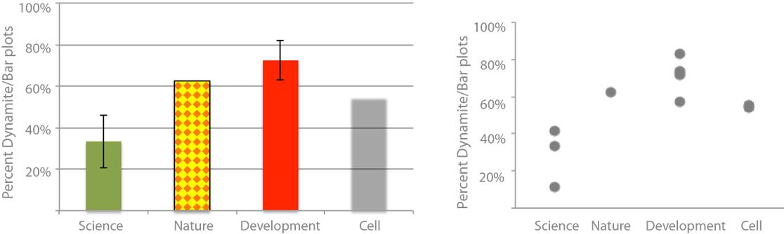
Are they common? Very much so! My personal survey (footnote 1) of dynamite plots in scientific journals revealed that on average 30-60% of articles use them (see figure). These journals cover a wide range of subjects that include physics, meteorology or psychology where authors typically have rigorous training in applied mathematics. The prevalence of dynamite plots increases as we go towards more life science journals, where 50- 70% of articles are accompanied by a dynamite plot showing a statistical summary (footnote 2).
Most of us are completely accustomed to dynamite plots and happily use them, that is, until we see the light. From then on it is impossible to not hate them! Because it is so obvious they are misleading and they just make it harder than necessary to understand the data! And, as scientists, we thrive for clear and concise information!
The top reasons to avoid dynamite plots
- They hide the real distribution of data. Do all samples cluster closely? Do they form two groups? Or is there one drastic outlier? Generally, we assume a normal distribution of the data around the mean where there might not be one! In my survey of dynamite plots per journal they were more or less normally distributed.
- They hide the sample size. From the bar plot you would not have known that I probed one issue of Nature, two issues of Cell and four issues of Development! But for judging scientific data knowledge of the sample size is essential for a proper evaluation of the data! Too often we have to search for the n in axis labeling, figure text, the results, or the methods section to finally find this information. And sometimes it is omitted entirely. A clear understanding of sample size in my opinion is also critical for the review process of a paper and should be demanded by the reviewers! Not showing data, or only showing summary data, should be treated equally to cropping Western blot bands!
- Many different data distributions lead to the same bar! See also the Anscombe quartet. Bar plots are not intended to show statistic distributions, they are for absolute numbers. And, by plotting the real data we also learn more about the biology!
Not quite convinced? Seeing is believing, check out this figure:

Further information: watch the video of the kickstarter campaign (humor alert!) – ideally with your entire lab! And read this seminal paper on wrong usage of bar charts and this survey of their prevalence in biomedical journals!
Practical advice to avoid dynamite plots
- Plot charts with statistical programing tool R. You have to either learn it, or be really nice to someone who knows it – if your PhD requires 3 boxplots, maybe invest in a friendly relationship with the bioinformatic geek in your department, a couple of coffees go a long way!
- Learn how to make box plots in excel! (Here and here is how, but it’s a bit tedious).
- Can’t be bothered to do either? Use one of the available web tools such as the boxplot maker from the Tyer’s lab or the plot generator from the University of Belgrade.
Footnotes:
1) I probed the top10-articles of Nature in July, the three most recent volumes of Science (August), four issues of Development (Vol 138, 1:3(2011) and Jan 2016), and two issues of Cell journal from 2016 (Jan and August). I was very relaxed in my judgement and gave the benefit of doubt when I wasn’t sure. But I was rigorous when authors mixed right and wrong usage of bar plots. How does this even happen? Mix of co-authors and some know better than others?
2) Disclaimer: this does not mean the other articles have great figure design in any of the journals! I saw multiple uses of 3-dimensional pie charts, rainbow color schemes, other instances of unintentional usage of color, incomprehensible spider graphs and 3-dimensional heat maps! Maybe I will devote another blog post to those.
 (11 votes)
Get involved
Create an account or log in to post your story on the Node.
Sign up for emails
Subscribe to our mailing lists.