Vote for a Development cover – Woods Hole – round 2
Posted by the Node, on 31 May 2012
The winner of the previous round of images from the 2011 Woods Hole embryology course appeared on the cover of Development a few weeks ago. But which of the following will receive the same honour? It’s up to you to decide: vote in the poll below the images for the one you would like to see on the cover of Development. (Click any of the images to see a bigger version.) Poll closes on June 19, noon GMT.
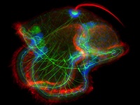
 1. Widefield image of a pilidium larvae of the Nemertean ribbon worm, Cerebratulus lacteus, stained for F-actin (green; phalloidin), Acetylated tubulin (red) and DAPI (blue; nuclei). This image was taken by Joseph Campanale, Aracely Lutes, and Stephanie Majkut.
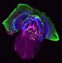
 2. Confocal image of Crepidula fornicata (slipper limpet) embryo stained for FMRF (yellow), Acetylated tubulin (green) F-actin (purple; phalloidin) and DAPI (blue; nuclei). This image was taken by Juliette Petersen and Rachel K. Miller.
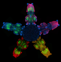
 3. Confocal image of squid, Loligo pealei, embryo stained for for F-actin (green; phalloidin), Acetylated tubulin (red), anti-HRP (yellow), and DAPI (blue; nuclei). This image was taken by Juliana Roscito.
 4. Confocal image of squid, Loligo pealei, embryo stained for for F-actin (red; phalloidin), Acetylated tubulin (green), and DAPI (blue; nuclei). This image was taken by Lynn Kee.


 (10 votes)
Image number one is far and away the most artistic and captivating.
Beautiful! Really hard to choose just one.
Image 2 is almost like a piece of art work. They are all beautiful but 2 is so artists to look at very beautiful and well done. It would make a wonderful cover.
No!, pharyngula is corrupting Crepidula fornicatas victory.
Also, beautiful images, especially number 2.
First choice would be 1. Then 2. Then 4. Then 3. Not a fan a constructed symmetry.
I think 1 is well balanced and displays a wide range of colors while accentuating the underlying structures and evoking the feeling that the image is of a mysterious but living thing.
All the images however, are amazing and convey the complexity and beauty of life. Plus they are super-awesome ™.
I vote for all four to grace the cover! Each in their own quadrant … all great pics!!
I see a great Georgia O’Keefe thing happening with the second image. Close ups, just as pretty and potentially more captivating than the original. Plus symmetry is over-rated.
I voted for #1……………hope it wins.
I vote for photo #1. This should win for sure!
Number two is “node”ally awesome!
Number two is fantastic! very good!
Congratulations to #1 — all the images are beautiful but #1 is spectacular!!!!!