Venn, Euler, upset: visualize overlaps in datasets
Posted by Helena Jambor, on 25 May 2018
Visualizations for comparing datasets is a topic in all my data viz classes. Current solutions for comparing 2,3, 4 and more datasets are diverse and some are controversial. A one-fits-all solution does not exist, but there are well-working solutions, and some that should be avoided.
1-3 datasets
Comparing two or three datasets works well in Venn diagrams. Most people learn them in school, and if not they are intuitive*. Each dataset is shown as a circle and they are arranged such that all overlaps are shown. Done.

More datasets
Things get problematic when comparing more than three datasets. Mathematically, it is not possible to show all overlaps of four or more datasets with circles. One possibility is to leave out some overlaps, as is often done in Euler diagrams. In the example below the overlap between “oocyte stage 2-7” and “oocyte stage 9” is for instance not visualized (RNAs localized in the oocytes across development, see publication). I find it however confusing when data is left out and sometimes “no overlap” is an important information itself.

Venn himself devised the diagram comparing four and more datasets by switching from a circles to ellipses. Branko Grünbaum developed the ellipsoid representation further for comparison of five dataset by . Their strategies are used by the online tool Draw Venn (Yves Vandepeer, Univ of Gent) where you can make Venn plots by simply uploading your data there. A variation is used by Heberle et al here (publication). There is also an R package by Victor Quesada.
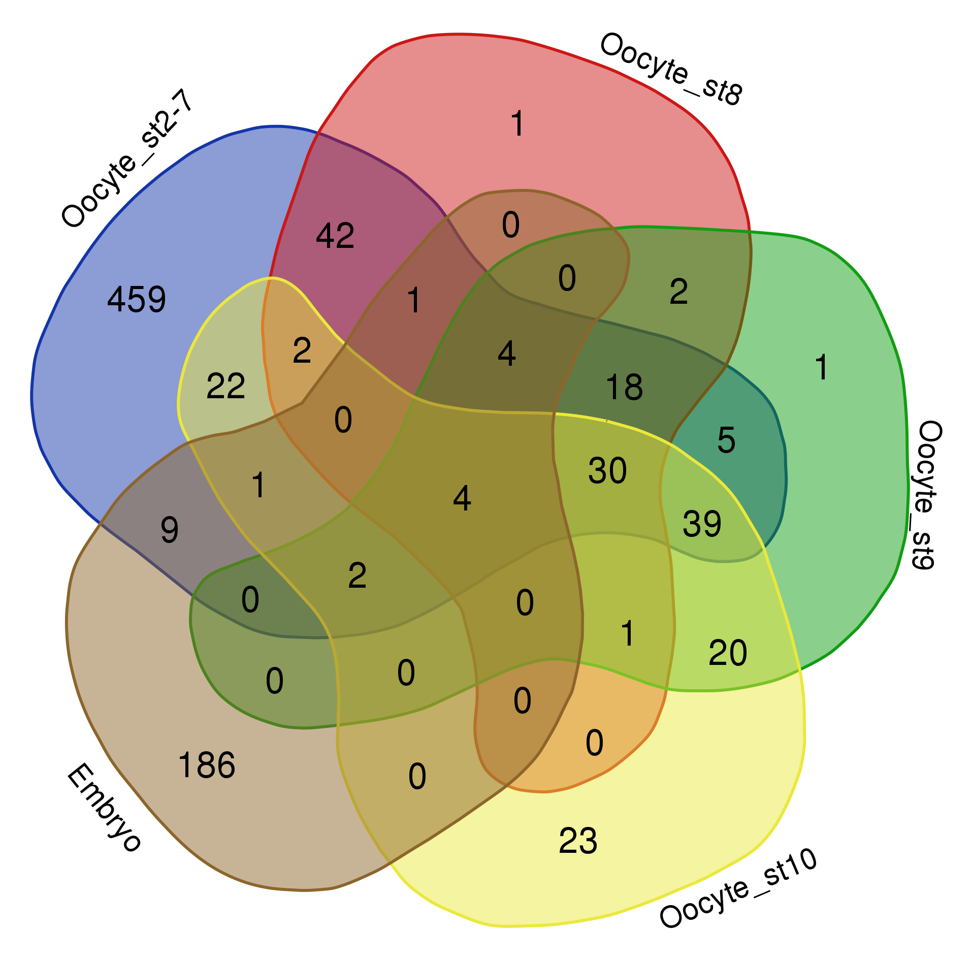
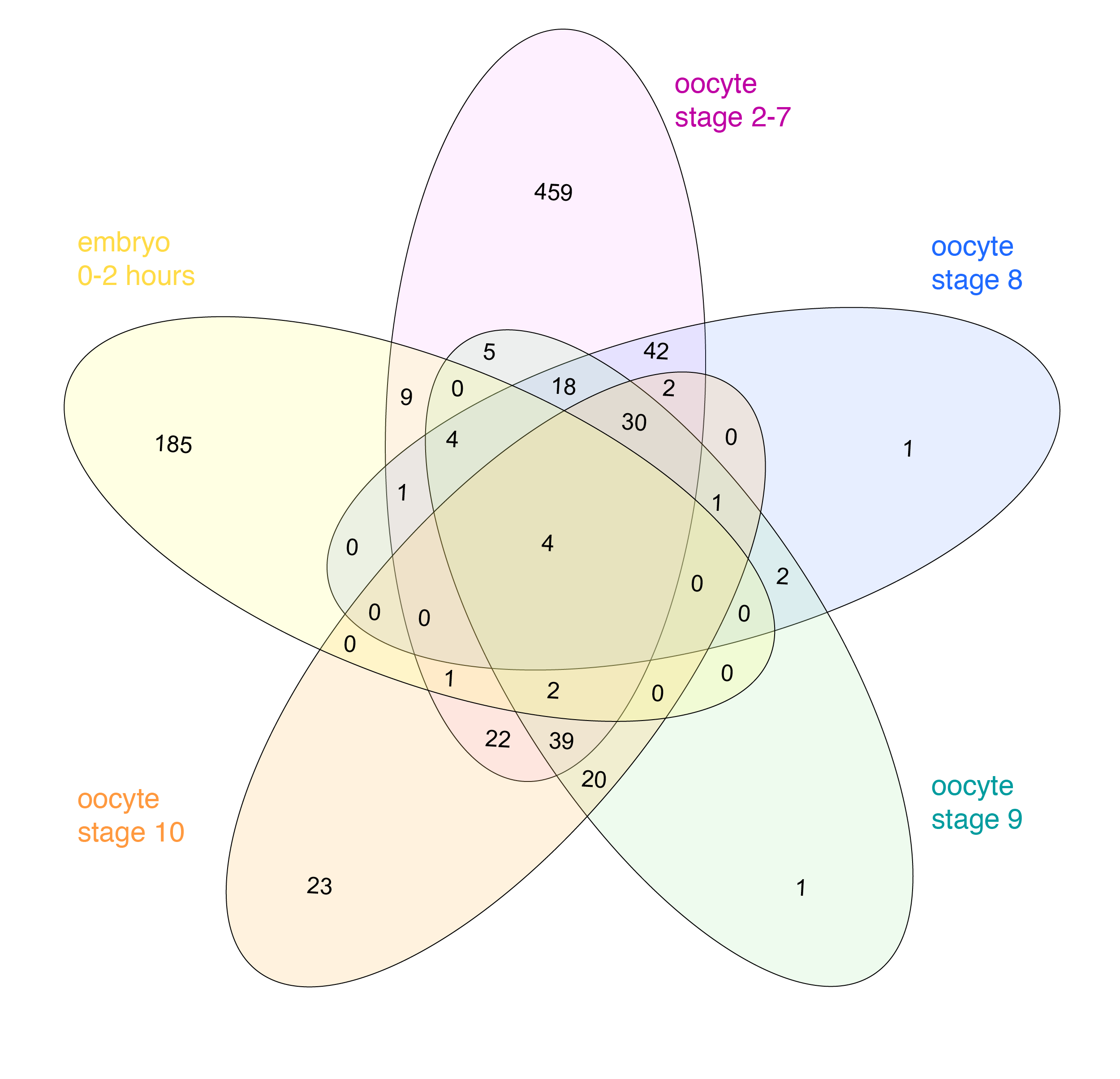
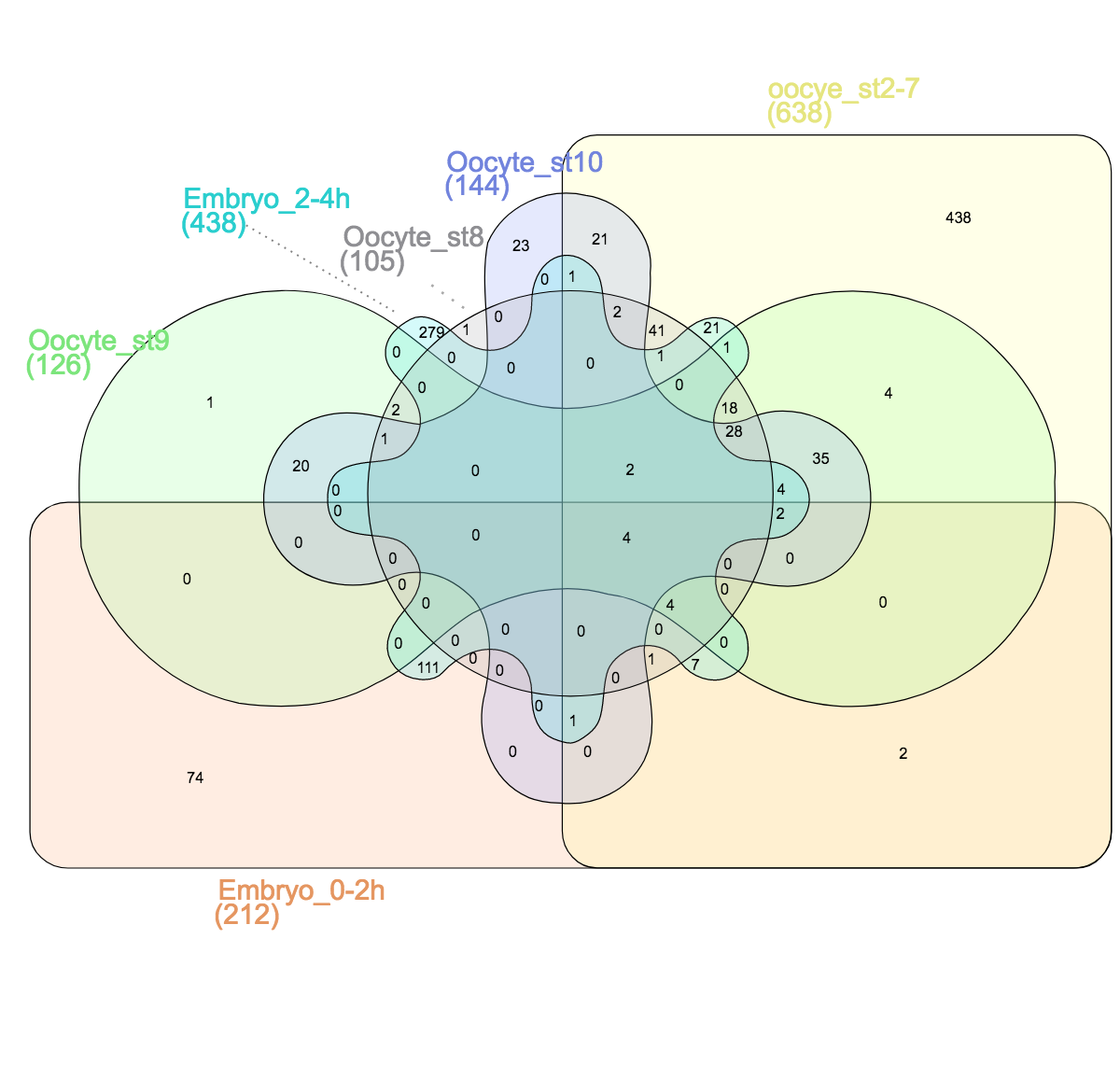
I find there are two problems for Venn diagrams with more than three datasets. First, it takes long to read them and extract all information: comparing four datasets gives a diagram with 15 regions/11 overlaps, five datasets gives a diagram with 31 regions/26 overlaps! I invariably end up writing the numbers down into my own table. Secondly, the areas can’t possibly be representative for the overlap size – and this is a lost information.
New: upset plots
An alternate solution, the upset plot, was developed by Niels Gehlenborg and Jake Conway. Presence of dataset elements in a given intersect is shown with a dot in a simple table. The size of the intersect is represented with a bar chart. Both are simple visuals that are easy to consume. Their package is available in R and simple to use.
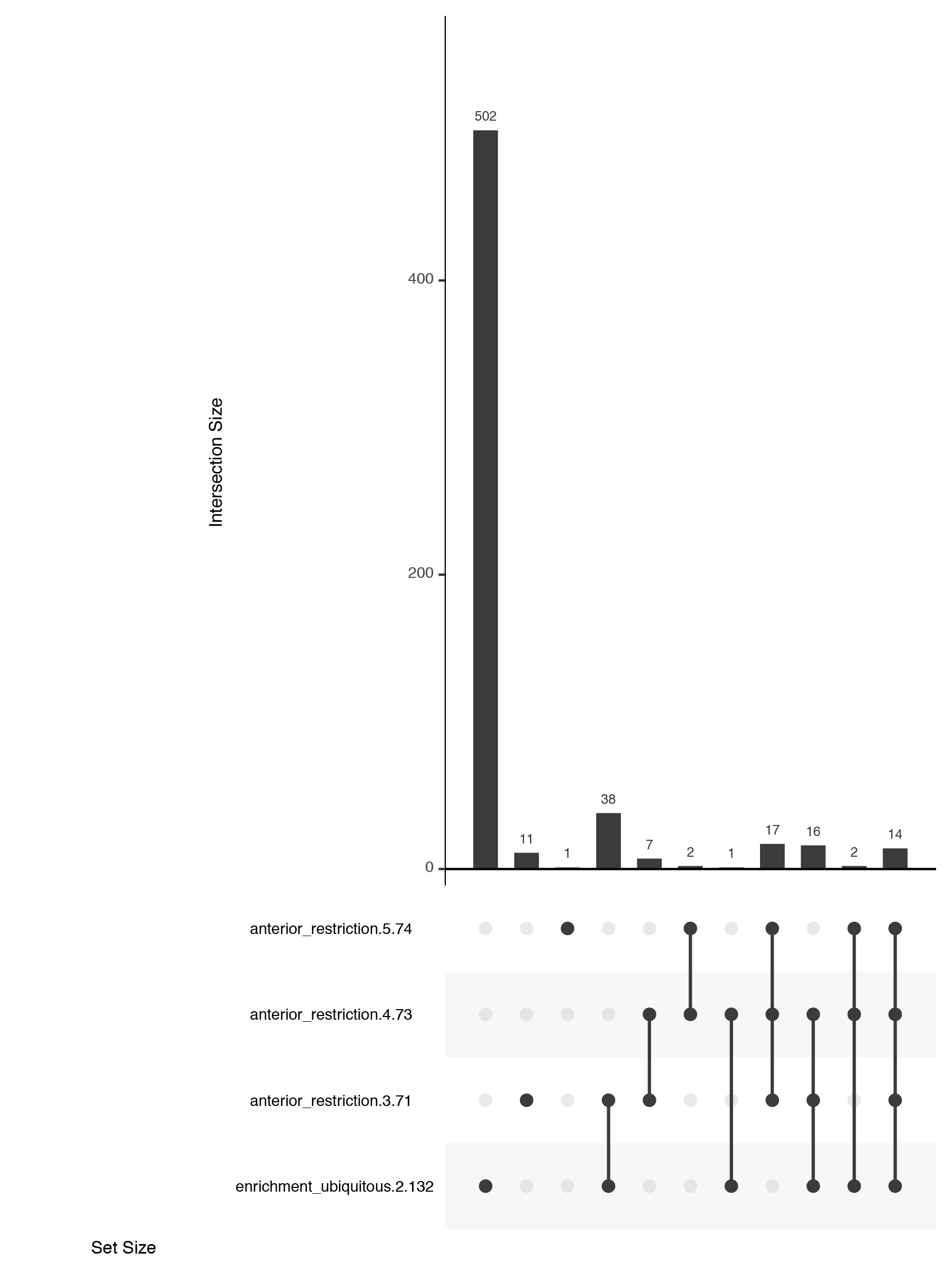
Customising upset plots
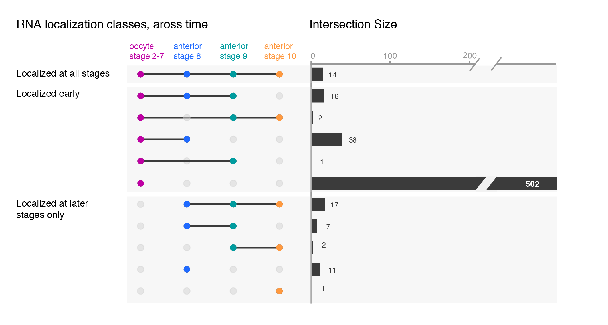
While the upset plots are simple, I think they can be improved. In upset plots the intersect is shown above the actual datasets, that serve as the legend. Basically, one is forced to read the upset from the bottom up. By flipping the plot horizontally this caveat is overcome: now the datasets are on the left, where we typically read first, and the bar is shown on the right nicely accompanying the respective set. Another improvement is to clearly label the intersects e.g. “present in one set”, “two sets” and to group them visually. Additionally, I have also color-coded the datasets to provide a quicker way of orienting the reader.
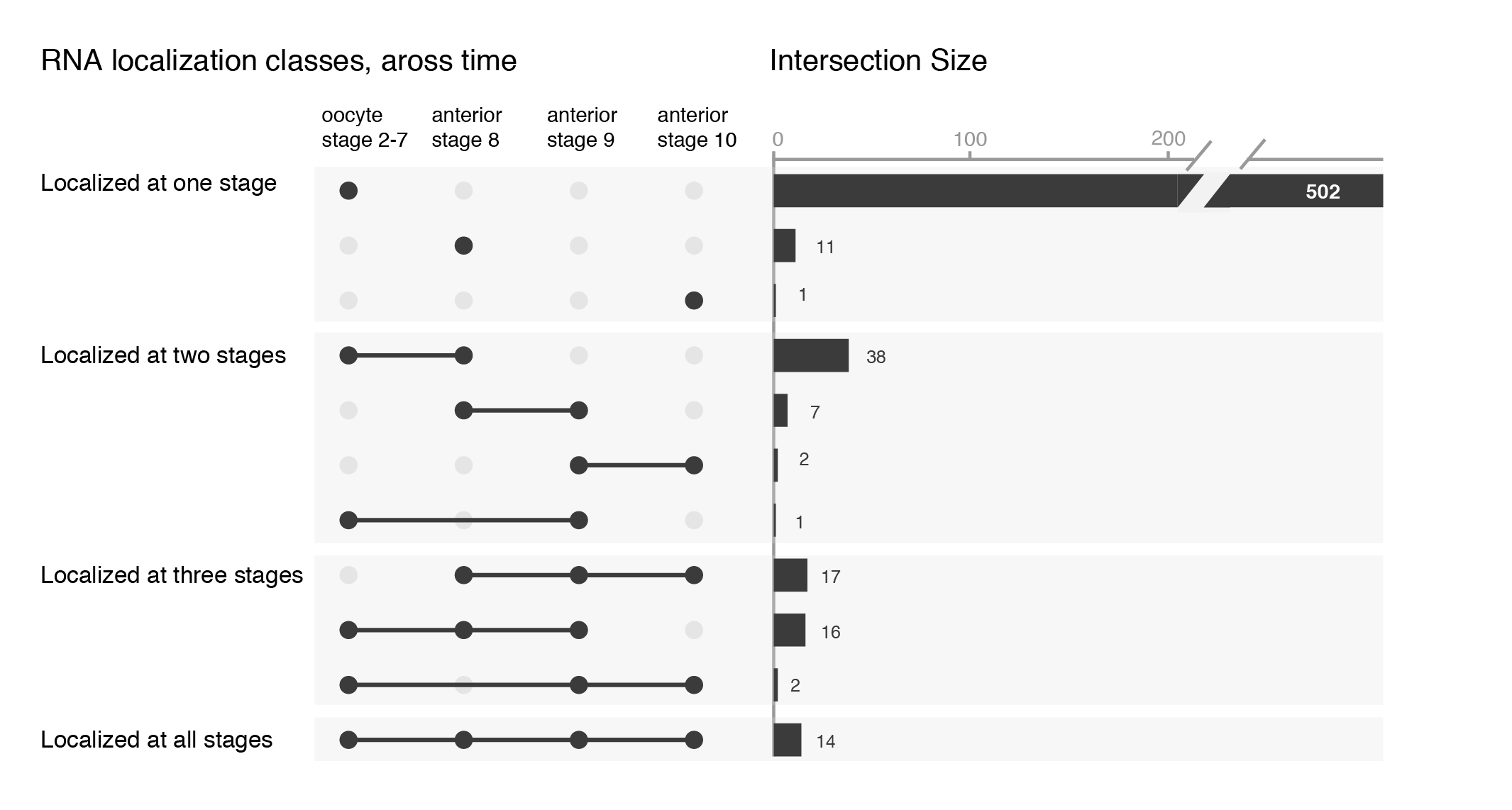
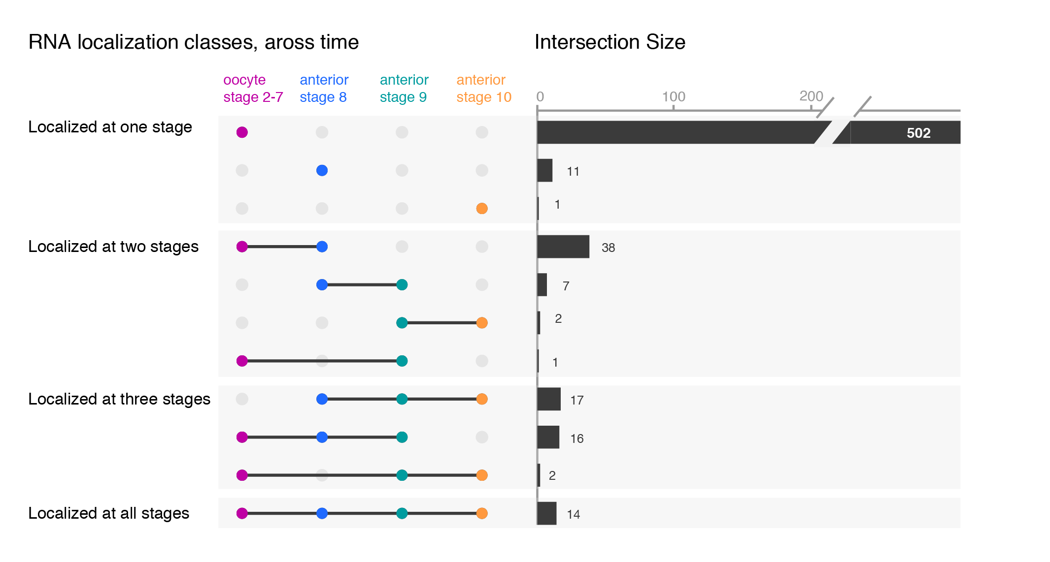
Depending on your message, you will have to find the optimal ordering strategy. I visualized the subcellular enrichments of RNAs and how they change localization during the development of the fruit fly oocyte. I would want to learn e.g. what happens to the hundreds of specific RNAs that enrich at early stages? Do they remain localized at all stages? It turns out the majority gives up their specific subcellular enrichment and instead become distributed inside the cell while other RNAs (not visualized here) take their place (more information on the biology).
Note, I did all the fine-tuning of the upset plot with illustrator but most likely it is also possible in R directly.
* Be aware that more people than you expect do not know Venn diagrams & require an introduction!
 (16 votes)
3 thoughts on “Venn, Euler, upset: visualize overlaps in datasets”
Leave a Reply
Get involved
Create an account or log in to post your story on the Node.
Sign up for emails
Subscribe to our mailing lists.
Great article!
Thank you
Hello,
I was looking for a graphic of watercolor Venn diagrams to use in a display in my small university library about Academic Sexist Exclusion when I ran across your beautiful photo. Would it be okay with you if I used it as part of my display with credit? It would only be hung in our library and there would be no profit made from the project.
Hi, I discovered the upset plot a few months ago, and while I really liked it as a way to show multiple Venn diagrams in a single plot, it was confusing for some people. I think your customization changing the direction and adding colors would really help people understand it at a glance. Would you mind sharing the R script with those customizations? I don’t know if you already added a link but I could not find it. And I’m a beginner R user, so making those changes by myself seems way too complicated. Thanks in advance!