Visualize it!
Posted by Natascha Bushati, on 19 July 2011
Here’s a short “behind the scenes” on our paper about visualizing gene expression data, published in Nucleic Acids Research.
When I joined James Briscoe‘s lab as a postdoc, my project’s ultimate goal was (and still is) to decipher and model the gene regulatory network underlying neural tube patterning. For this, I need to know where, when and which genes are expressed in the neural tube. Having spent the first few months optimising a protocol to isolate manipulated neural tube cells, I started generating transcriptome data using Affymetrix microarrays. I quickly realised that the amount of the data these assays produce accumulates very rapidly – we were analysing dozens of samples at the same time and measuring tens of thousands of genes. The complexity of these data made their analysis very difficult. Fortunately around about this time I met Chris Watkins, a computer scientist at Royal Holloway, University of London.
Chris happens to be an expert in the field of “machine learning”, the branch of computer science that aims to develop algorithms that identify patterns in complex data and make decisions based on these patterns. Over the years, he has worked in various fields including epidemiology and artificial intelligence and for a while he was employed by hedge funds analysing financial data. The connection between these fields is the desire to find patterns in large sets of data. So although Chris had never seen or worked with transcriptome data before he was instantly familiar with the problem I faced.
One of the goals with transcriptome data is to define sets of co-regulated genes and identify patterns of gene expression. For this clustering algorithms (e.g. hierarchical clustering, k-means clustering) are often used. These are powerful techniques, however, while using them I realised they have limitations. I was struck by two major drawbacks. First, the algorithms tend to be “black boxes”. They are designed to produce sharp delineations between the clusters of genes and it was noticeable that different methods often produced quite different classifications. It was never clear which method produced the most valid clusters and why one algorithm partitioned the data in one way while another algorithm put the same genes in different clusters. The second drawback of these techniques is that they do not reveal global patterns in the data. You are left with a series of seemingly unconnected lists of genes – clusters – and you are not sure how these clusters relate to one another.
I explained my angst to Chris and he suggested developing a visualization of the data that would allow us to explore it in a more intuitive manner. After some false starts he came up with a method that proved useful. He was aware of a recently developed “dimensionality reduction” algorithm called t-distributed Stochastic Neighbor Embedding (t-SNE) and although it had never been used on transcriptome data before, Chris thought it might be suitable for our needs. What is “dimensionality reduction”? Perhaps the most familiar example is maps of the world – these are 2D representations of the 3D globe. The aim of these maps is to accurately represent the distances between locations on the surface of the earth. Of course it’s impossible to draw the perfect 2D map of the 3D world and depending on the compromises that are made by the map maker you end up with different types of maps – the most familiar are the Mercator and the Gall-Peters projections. Dimensionality reduction algorithms aim to generate 2D projections from data that has more than three dimensions. A set of transcriptome data typically has several different conditions and each of these conditions can be thought of as a dimension (e.g. 6 conditions = 6 dimensions). The expression level of a gene is measured in each condition and these measurements can be thought of as the position of that gene in each condition/dimension. The image you can think about to help understand the idea is a cloud of points in high dimensional space with each point representing a gene. The goal of dimensionality reduction algorithms is to project this cloud of points into two dimensions in a way that preserves the spatial relationships between the points as much as possible.
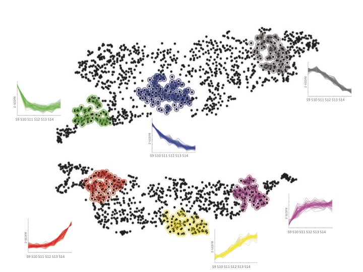
The initial tests of the t-SNE method seemed to indicate it worked nicely for transcriptome data. We then managed to persuade a computer science undergraduate, James Smith, to spend the summer in our lab turning the t-SNE computer code into a little package that made it much easier to use. This allowed me to try it out on many different data sets, some of my own and some published by other labs. As you can see in the paper (and in the image below of Fang et al.‘s data from developing human embryos) the method nicely projects complex gene expression datasets into a two-dimensional map in a way that makes the relationships between genes easy to visualize and understand.
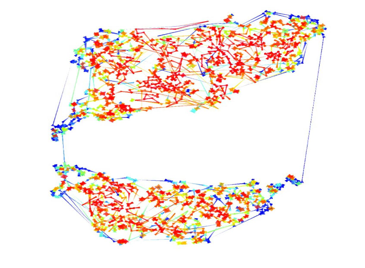
Each gene is represented by a point on the map and is surrounded by genes that have similar expression patterns in the data set. The software tools that James wrote over the summer allowed easy interactions with the maps and provided ways to visually cluster genes. One of these support tools – Chris called it “neighbour plots” – produced some really beautiful images.
My experience with the t-SNE algorithm, so far, is that it makes identification of co-regulated genes much easier and more intuitive than other methods. One thing that I’ve found is that it is particularly useful when used in conjunction with established clustering methods. Overlaying onto a t-SNE map the cluster assignments, from a regular clustering algorithm, using different colours provides a way to assess and explore the partitioning decisions in the clustering. And it’s finally allowing me to start to make sense of some of the data I’ve been generating.
All the code for using the t-SNE algorithm for gene expression data is available from our website – here. It’s in the form of a MATLAB-implemented graphical user interface. If you try it out and have ideas of how to improve or change it, do let me know!
Bushati N, Smith J, Briscoe J, & Watkins C (2011). An intuitive graphical visualization technique for the interrogation of transcriptome data. Nucleic acids research PMID: 21690098
Fang H, Yang Y, Li C, Fu S, Yang Z, Jin G, Wang K, Zhang J, & Jin Y (2010). Transcriptome analysis of early organogenesis in human embryos. Developmental cell, 19 (1), 174-84 PMID: 20643359


 (7 votes)