Visualizing the heterogeneity of single cell data from time-lapse imaging
Posted by Joachim Goedhart, on 12 December 2018
When we examined the kinetics of Rho GTPase activity in endothelial cells in response to receptor stimulation (Reinhard, 2017), we noticed considerable cell-to-cell heterogeneity. In the original work we published graphs with the average response, reflecting the response of the whole cell population. However, these graphs fail to show the cellular heterogeneity. What is the best way to visualize these data? I don’t know, but I will explore several options to visualize all individual traces from the experiment.
1. All together
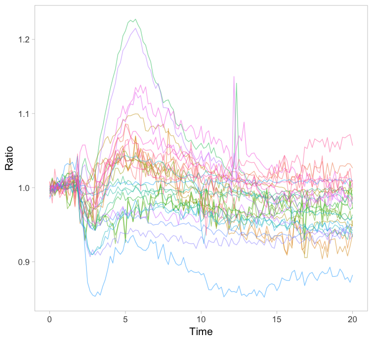
The original paper displayed the average responses of the Rho GTPases RhoA, Rac1 and Cdc42 and the graphs were remade with R/ggplot2 in this blog. Since the Rac1 data showed the largest differences between cells, I took this data to explore different ways of visualizing it. One can simply plot all the individual lines together with the average response in a single graph (figure 1). How this can be achieved with R/ggplot2 is explained in this blog. The graph may look cluttered when there are many lines and therefore it is advisable to use thin gray lines. To enable the identification of individual traces one may use a unique color for each trace. Putting all traces from a single experiment in the same graph is a simple but effective method to depict variability. However, putting all data in a single graph for multiple conditions is usually makes the graph difficult to understand.
Figure 1: Ordinary graphs showing the data from individual cells as thin lines on top of each other. In the left panel the average is shown as a thicker black line. In the right panel the data from each line has a unique color to improve identification of cells.
2. Ridges
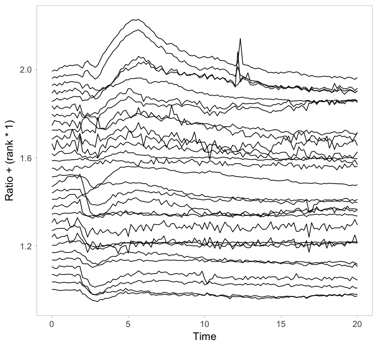
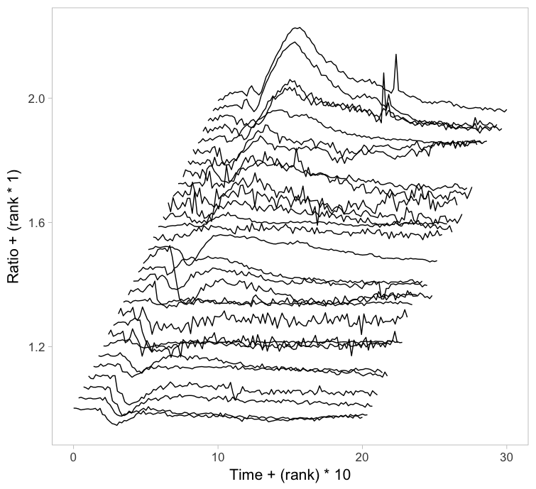
Instead of putting all graphs on top of each other, an offset along the y-axis is introduced, which reduces overlap. This type of plot is called a ridgeline plot (formerly known as a joyplot). By adding an increasing offset for the x-axis, the curves are further separated and a 3D effect is generated. This may result in a nicer plot to look at, but it comes at the cost of impeding quantitative interpretation. For example of the use of ridgeline plots fro kymographs see this blog.
Figure 2: Ridgeline plots showing the individual cellular responses with an offset in the vertical direction (left) or an offset in both vertical and horizontal direction (right).
3. Small multiples
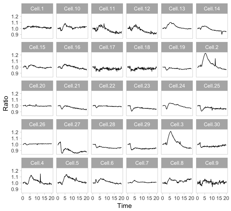
Instead of plotting all lines in a single graph, it is also an option to show all lines in individual plots. This type of design is coined the “small multiple” and it was popularized by Edward Tufte. The presentation of small multiples is not limited to line graphs, but be used to depict other types of data, e.g. several still images from a movie.
Small multiples can be reproduced in R/ggplot2 by using ‘faceting’ and this has been briefly highlighted in a previous blog (near the end). Figure 3 (left) shows the standard output of ggplot2, with labels for each plot. In my opinion, the small multiple is at its best when it is trimmed down to the bare minimum. As an example, I made a minimalistic variant with a high data-ink ratio (figure 3, right). Although numbers are absent, this visualization still allows for quantitative comparison and it shows the heterogeneity. In summary, the small multiple is a great way to depict the individual data, but it requires quite some space.
Figure 3: The small multiple presentation of the time-lapse data shown as the standard output of ggplot2 with facets (left) and a minimalistic version (right) with improved data-ink ratio.
4. Heatmap
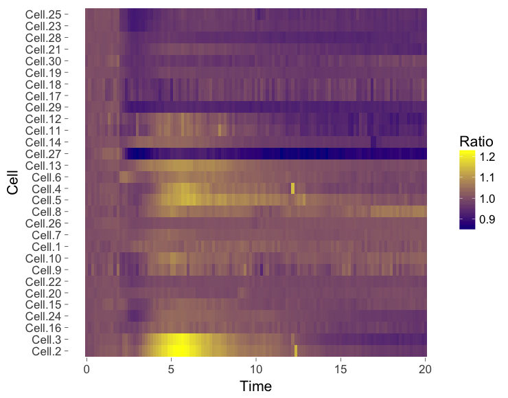
The ‘heatmap’ is well-known for the visualization of microarray data. It can also be used for different types of data including time-series data. To generate a heatmap, the actual numbers of each of the line graphs are color coded and these are presented as a line. Every line (row) of the heatmap represents a single trace from a time series experiment. The result is an image in that shows the responses encoded by colors (figure 4).
As the data is encoded by color, the quantitative comparison of the data is limited to comparing colors. This comparison is inherently non-quantitative. As such, the downside of a heatmap is that it only allows qualitative interpretation. Still, heatmaps enable the visualization of a lot of data on a relatively small space.
Figure 4: Heatmap style presentation in which each row represents the data from a cell. The response is color coded according to the legend. The data is presented in order of acquisition (left) or clustered based on similarity (right).
Sorting out the mess
The data from single cell experiments can be very heterogeneous (as in this example) and may look like a mess. To structure the data, it can be sorted or grouped. Sorting uses a feature of the data that can be used to rank the individual traces. For instance, for the ridgeline plot (figure 2) the maximum response of every trace was determined. Subsequently, the plots were ordered based on the maximum response (ratio) that was observed. Any other parameter can be used to order the data, e.g. integrated response, timing of the maximum response or noise of the baseline.
Another method to structure the data is grouping or clustering. For the data presented in the heatmap a hierarchical clustering was performed (figure 4, right), which determines the pairwise difference for each of the traces. The ouctome is an order of traces that groups similar responses together. There are many ways to cluster data and information on this topic can be found elsewhere (for instance here, here and here). In the end, the sorting or clustering of the time-lapse data may structure the data and aid interpretation. It can precede any of the visualizations shown above, but it makes most sense for ridgeline plots or heatmaps.
Howto
This blog explores several options to visualize data, but does not go into detail on how to achieve it. The code (and data) that was used to generate the graphs is available at Zenodo (http://dx.doi.org/10.5281/zenodo.2211123) and should give some idea of how to achieve the different visualizations in R/ggplot2. Alternatively, some of the plots shown in this blog (including small multiples and heatmaps) can be made with a web-based tool PlotTwist that uses R/ggplot2 but does not require coding skills. A nice feature of the web tool is that the presentation of the data (e.g. visibility of the lines and their color) can be adjusted in realtime.
Final words
Showing all of the data is important for full appreciation of experimental results. Since cell-to-cell variability is observed in every single imaging experiment, methods to visualize the heterogeneity are needed. Here, I have highlighted several methods to visualize data from time-lapse imaging. These methods may be combined with some way of sorting or clustering of the data. Which approach works best for your data needs to be examined on a case-by-case basis and will depend on what you want to communicate. The different visualizations shown here may serve as a starting point to explore how to best visualize your data from time-lapse experiments.





 (14 votes)
Nice work, Joachim.
apart from uploading all results to a repository, we had not come up with better visualizations of variability. Variability is often thought off as a nuisance, but in fact it is real biology and we need to know it in order to advance.