Non-zero baselines: the good, the bad, and the ugly
Posted by Helena Jambor, on 20 June 2019
Of all the charts being ridiculed at WTFviz, many get shamed for their lack of a zero-baseline. When teaching DataViz, zero-baselines are invariably a topic of debate. The rules about zero baselines are necessary are often unclear. Therefore, let’s quickly recap.
Bar charts: always show zero
When we ecnode amounts by length, as done in bar charts, the zero-baseline is critical to reading the data. A bar twice as long represents that the category has twice the amount of counts. The number of the prestigious ERC starting grants to German host institutes roughly doubled from 2013 to 2014, correctly encoded by a bar twice the size in 2014 (A).
When the y-axis does not start at zero (B), the increase from 2013 to 2014 is over-emphasized and looks 4 to 5 times bigger. In (C) the baselines even starts above the first data point. This leaves entire bars out of the graph. The result is, that it appears as if only Germany received ERC funding in 2018.
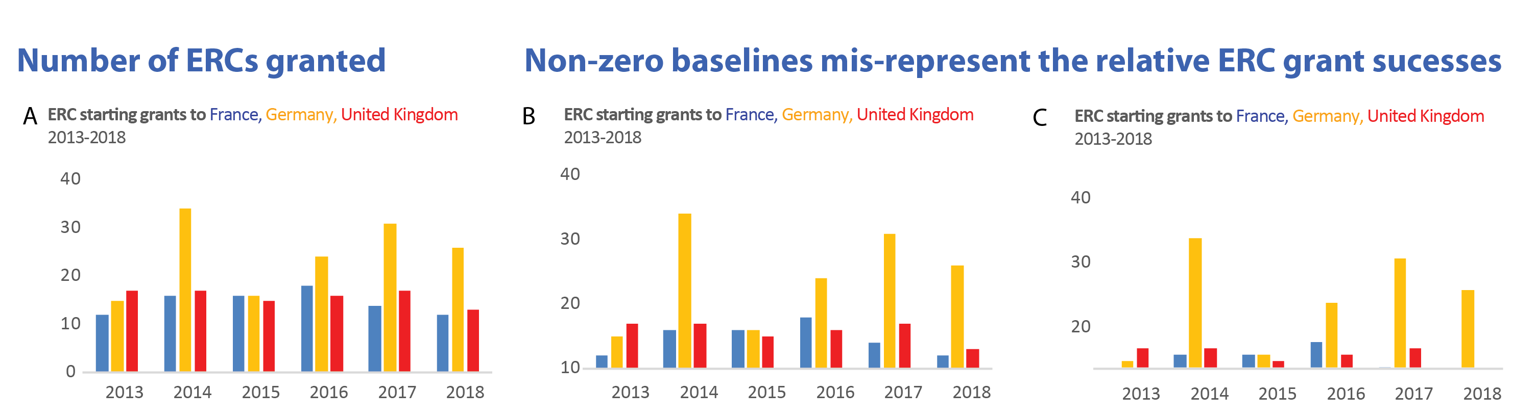
Non-zero baselines (and also axis-breaks in bar charts!) skew the relative difference between categories and mislead. But non-zero baselines are often used to save space, not to intentionally mislead. Then, the chart could simply be shown with a less overall height. This option maintains the relative bar sizes faithfully. When reading bar charts we are always interested in relative, not absolute size differences among our categories. (And I learned that Israel is part of the ERC funding consortium!)

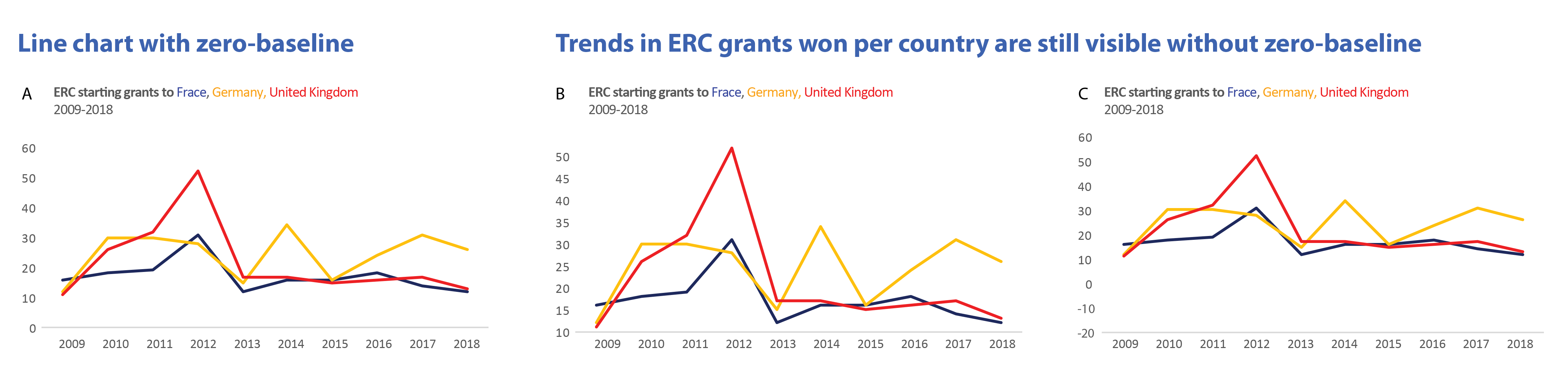
Line charts are happy without zero
The situation is entirely different for line charts. We use them to show trends, e.g. increase or decrease in categories over time. The rate of change is encoded by the line slope relative to the horizon. For this, its distance to zero is not critical. Even without the zero-baseline we see that ERC success in Germany fluctuates, while UK and France have stable funding rates. And, no matter where the zero-baseline is, why does the UK have such a curious funding peak in 2012, what happened there!?
Sometimes showing zero is misleading
Showing a zero-baseline is sometimes misleading in line charts. Think of a fever curve with a human body temperature scale from 0-100 ˚C. Such a scale would prevent us from seeing a life-threatening increase of 1˚, from 39 to 40˚C in a patient. Similarly, showing global temperatures at a scale from 0 to 120˚C results in an entirely flat line. It was used by opponents of climate research to hide man-made global temperature changes. (And an outcry at twitter swiftly followed).

Distributions: it depends on the data
When showing statistical summaries, again the zero often is not necessary to be visible. We are interested in the shape of the data (normal or bimodal), it’s median, and outliers. How far the majority of data points are from zero is not usually of interest as long as all data is shown. Instead, the relative distance of individual data points from each other are key.
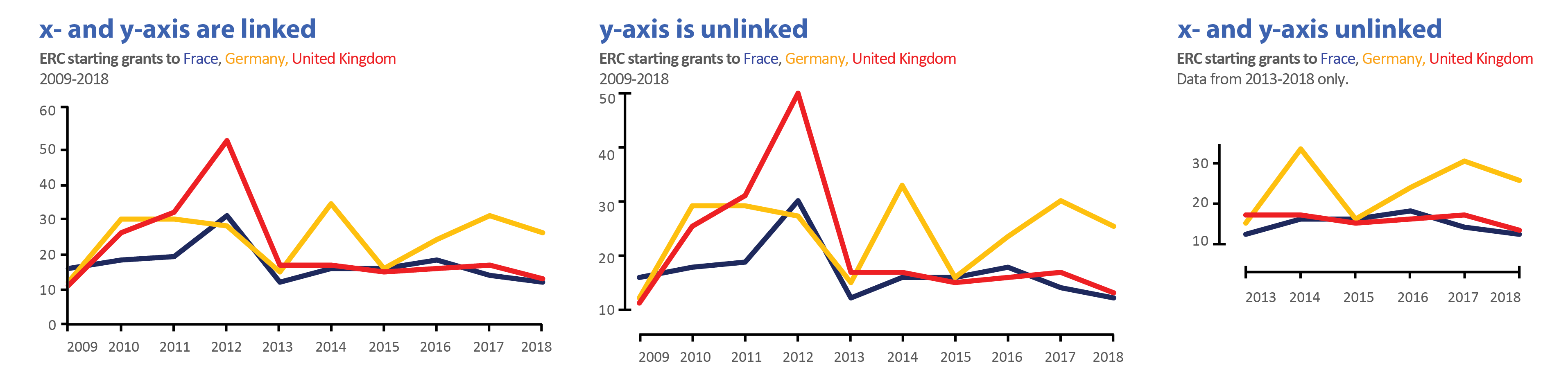
Good practice for non-zero baselines
When using non-zero baselines, the common practice is to unlink the x- and y-axes. For educational purposes I cut data from the right example. This is a dangerous territory and in some cases may be misleading the audience. In this example, I effectively hide the early lead of the UK in winning ERCs!
Data European Research Council, https://erc.europa.eu/projects-figures/statistics, starting grants from 2007-2018.
 (5 votes)
Get involved
Create an account or log in to post your story on the Node.
Sign up for emails
Subscribe to our mailing lists.