Unboxing data
Posted by Joachim Goedhart, on 24 April 2026
Thanks to community campaigns (#barbarplots) and opinionated papers (Drummond & Vowler, 2011; Weisgerber et al 2015) the dynamite plunger plot (a bar plot together with an error bar) has been abandoned as the default graph. The main reason to reject bar plots is that they display only an abstraction of the actual data and therefore oversimplify it. For full transparency and interpretability, the all data should be displayed. This can be achieved effectively by displaying the data as dots (or other symbols).
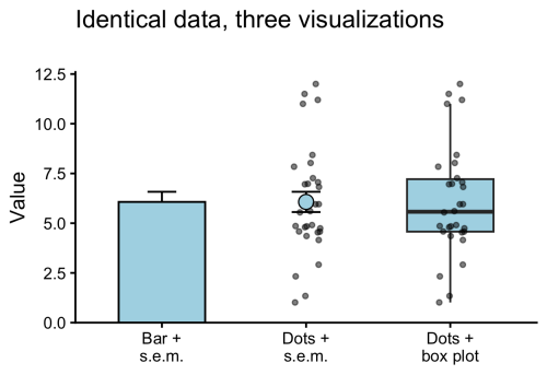
The dot plots are often accompanied by a graphical statistical summary. Common statistics are the mean or median. A more comprehensive statistical summary is provided by the box plot. The box plot was first proposed by Mary Eleanor Spear in her book “Charting Statistics” and publicised by the work of John W. Tukey. Open source tools, such as the user-friendly web tool BoxPlotR, have contributed to a wider adoption of box plots in publications. The box plot is characterised by 5 values, the median, the two borders of the box that indicate the IQR, and two whiskers. The whiskers can reflect multiple things, but most commonly indicate the most extreme data-point that is maximally at 1.5 x IQR from the border of the box (Krzywinski & Altman, 2014).
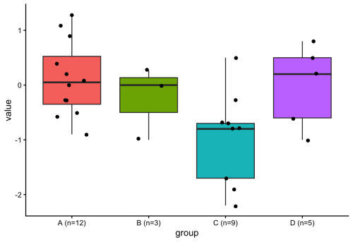
Since a box plot summarises the data distribution with 5 values, it does not add any information when the data consists of only 5 or less points. This can also be seen in figure 2 for conditions B & D. Adding a box plot to a condition that has only 5 datapoints would be similar to adding the mean for only 1 datapoint. Since some datasets have variable numbers of observations per condition, it would be ideal to only display the box plot when sufficient observations (n>5) are present. To do this in R with {ggplot2}, I considered defining a new geom (if you are interested in that, I recommend this tutorial), but then I realized that it can be done by filtering the data within the box plot function (inspired by the work of June Choe on {ggtrace}, see also this video: https://youtu.be/dUBnitXf5mk).
The trick is to use a filter() function within the geom_boxplot() definition to keep only the conditions for which n>5 (aggregated for each condition by group_by(group)). Here’s the R code:
#Filtered box plot, only drawing a box for conditions that have n > 5
ggplot(demo_data, aes(x = group, y = value, fill = group)) +
  geom_boxplot(
    data = ~ .x %>% group_by(group) %>% filter(n() > 5)
  ) +
  geom_jitter(width = 0.2, size = 1.5) +
  theme_classic() +
  theme(legend.position = "none")
The resulting plot only shows a box plot when n>5:
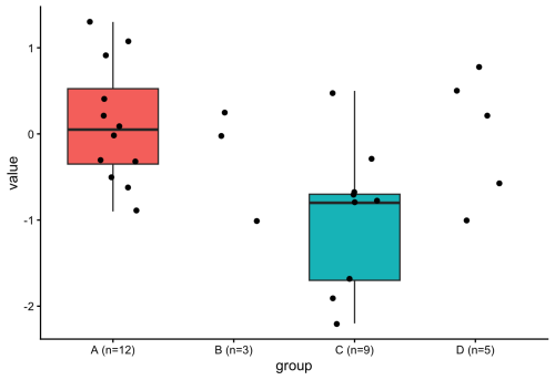
The use of a filter() function within the definition of a geom is an elegant method for getting rid of the box plot when the number of observations is too low. In general, this approach is very powerful and gives more control over plotting with ggplot2. There’s probably a ton of other applications, and one that comes to mind is to filter data based on some criterion and changing the color, e.g. for outliers. And, fun fact, Figure 1 was also created using the filter() function. Check out the R code (for all plots) here: https://github.com/JoachimGoedhart/Unboxing-data
 (2 votes)
Get involved
Create an account or log in to post your story on the Node.
Sign up for emails
Subscribe to our mailing lists.