Converting spreadsheets to tidy data – Part 2
Posted by Joachim Goedhart, on 29 September 2020
The superplot was recently proposed as a data visualization strategy that improves the communication of experimental results (Lord et al, 2020). To simplify the visualization of data with a superplot, I created a web tool that is named SuperPlotsOfData (Goedhart, 2020). The superplot tutorial for R , the tutorial for Python and the SuperPlotsOfData web app use the tidy data format as input. The tidy data structure is different from the popular spreadsheet format and (in my experience) not intuitive to grasp. Therefore, the conversion of ordinary, spreadsheet data into this structure may present a considerable bottleneck for creating superplots. Here, I explain how to convert data from a spreadsheet (using R) into a tidy format to enable plotting with python, R or SuperPlotsOfData.
In a previous blog the conversion of a simple spreadsheet into the tidy format was explained, covering the basics. Here, I deal with a more complex spreadsheet that holds data of multiple replicates and two experimental conditions. The data is available here as an excel sheet or CSV file. A screenshot of the excel file is shown below. The first row lists the experimental condition and the second row identifies biological replicates. Each column holds the results from a measurement of speed. Since the measured data are distributed over multiple columns, this data is ‘wide’ and not tidy.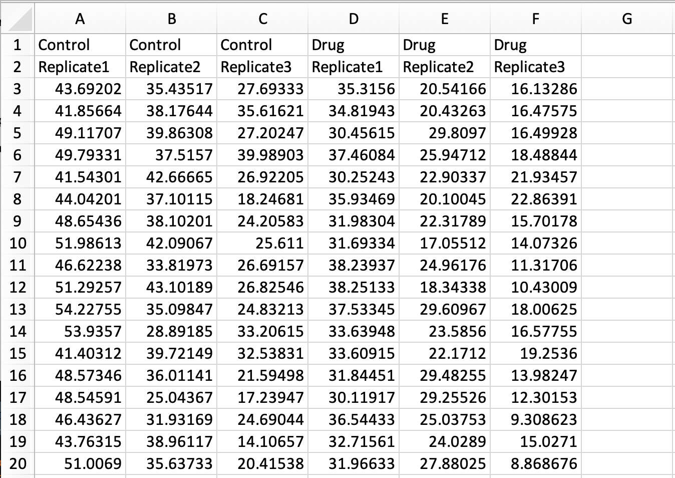
Tidying this data means that we have to move all the measured data into a single column. As we will see in the end result, other columns will specify the condition and replicate number.
In R/Rstudio we load two packages that are needed to read excel files and to reformat the data:
> library(tidyverse)
> library(readxl)
To load the data from the excel file and assign it to the dataframe ‘data_spread’ we use:
> data_spread <- read_excel("Data-with-replicates.xlsx", col_names = FALSE)
Note that in the command above, none of the rows is used to assign column names by specifying col_names = FALSE. The reason is that duplicate column names (as present in this file) are not accepted and will be modified. The column names will be assigned later on.
To obtain a vector with the labels for the conditions, the first row is selected, the type is changed to character and converted to a vector:
> conditions <- data_spread[1,] %>% mutate_all(as.character) %>%
  unlist(use.names=FALSE)
This is repeated for the second row that contains the labels for the replicates:
> replicates <- data_spread[2,] %>% mutate_all(as.character) %>%
  unlist(use.names=FALSE)
Next, row 1 and row 2 are removed from the dataframe, keeping only the data:
> data_spread <- data_spread[-c(1:2),]
The labels of the conditions and replicates are combined into single vector with unique labels:
> combined_labels <- paste(conditions, replicates, sep="_")
The vector with labels can be shown by typing:
> combined_labels
which returns:
[1] "Control_Replicate1" "Control_Replicate2" "Control_Replicate3" "Drug_Replicate1" "Drug_Replicate2" "Drug_Replicate3"
The new labels are used as the column names of the dataframe:
> colnames(data_spread) <- combined_labels
Now, we are ready to convert the dataframe into a tidy format:
> data_tidy <- gather(data_spread, Condition, Speed)
The first rows of the dataframe can be shown by typing:
> head(data_tidy)
which returns:
# A tibble: 6 x 2
  Condition          Speed
  <chr>              <chr>
1 Control_Replicate1 43.692019999999999
2 Control_Replicate1 41.856639999999999
3 Control_Replicate1 49.117069999999998
4 Control_Replicate1 49.793309999999998
5 Control_Replicate1 41.543010000000002
6 Control_Replicate1 44.042009999999998
Next, the labels in the column ‘Condition’ that identify the treatment and the replicate are seperated and assigned to individual columns that are named accordingly:
> data_tidy <- data_tidy %>% separate(Condition, c('Treatment', 'Replicate'))
The result is a tidy dataframe, in which all measurements of speed are located in a single column. In addition, we have columns that specify the treatment and the replicate number for each of the measurements:
# A tibble: 6 x 3
  Treatment Replicate  Speed
  <chr>     <chr>      <chr>
1 Control   Replicate1 43.692019999999999
2 Control   Replicate1 41.856639999999999
3 Control   Replicate1 49.117069999999998
4 Control   Replicate1 49.793309999999998
5 Control   Replicate1 41.543010000000002
6 Control   Replicate1 44.042009999999998
The dataframe can be saved as a CSV file:
> write.csv(data_tidy, 'tidy-Grouped-data.csv')
The saved CSV file can be used as input for creating superplots in python, R or with the SuperPlotsOfData app. In fact, the resulting file is exactly the same as the one that is used to generate the plots in supplemental figure S4 and S5 of the original superplots paper.
An R-script (Tidy-replicates.R) that combines all the steps is available here.
Final words
The spreadsheet data that I used here as an example has a specific structure that is designed to make a dedicated data visualization. Nevertheless, the strategy for conversion should be applicable for similar datasets that have two rows that define conditions and replicates. Although the format of the spreadsheet may not be similar to your own data structure, I still hope that this tutorial gets you started with the conversion of spreadsheet data into tidy data.
The primary goal of this tutorial was to prepare the data for creating a superplot. But it also serves as an example of converting spreadsheet data into tidy data. I think it is valuable to have more examples that deal with conversion of experimental data into the tidy format, since it is a powerful concept in data handling. To get a flavour of what can be done with the tidy data format in the context of data visualization, you can check out the ggPlotteR web tool (https://huygens.science.uva.nl/ggPlotteR/). This tool uses tidy data as input (and contains example data) to quickly generate and tweak a wealth of different visualizations.
 (2 votes)
Get involved
Create an account or log in to post your story on the Node.
Sign up for emails
Subscribe to our mailing lists.