Crafting plots for movies
Posted by Joachim Goedhart, on 6 May 2020
In a previous blog I explained how animated plots can be made to illustrate the dynamics of data. Animated plots go nicely together with the movies from which the data was extracted. Here, I explain how to display a movie and plot side-by-side, starting from a stack of images and using only open source software. I will use ImageJ/FIJI for image analysis and for creating the movie. Then, R/Rstudio is used for data processing, generating the animated plots and for adding the plot to the movie. A basic understanding of the software is assumed and necessary to complete the tutorial. The steps that are involved are 1) creating a movie, 2) quantification of signal over time, 3) labeling the movie, 4) creating an animated plot and 5) combining the plot with the movie.
The data
First, let’s discuss where the data came from. I acquired the data with TIRF microscopy, which is a technique that detects fluorescence at the basal plasma membrane of cells. TIRF imaging of cells expressing a GFP-tagged Protein Kinase C (GFP-PKC) was used to study the dynamic association of PKC with the plasma membrane, after stimulating the cells. The fluorescence intensity follows an oscillatory pattern that was triggered by adding UTP and that reflects calcium oscillations (Oancea and Meyer, 1998). The raw data, processed data and an R-scripts to generate the movie is available in a file archive at Zenodo.org, doi: 10.5281/zenodo.3785592
Step 1: Creating a movie
The data is astack of images named ‘EGFP-PKCbetaII_100uMUTP_16bit.tif’ which can be downloaded from the archive at Zenodo, or directly through this link. The TIF file can be opened with FIJI or ImageJ. To play the image stack as a movie press backslash [\] and again to stop it.
The first processing step is to convert the 16-bit stack to 8-bit (the line below refers to a ‘menu path’ like this: menubar > submenu > command):
Image > Type > 8-bit
A false color or lookup table (LUT) can be added to improve the visualization of the intensity changes:
Image > Lookup Tables > Fire
The ‘Fire’ LUT works well for this data, but other LUTs can be selected as well. To get the best result, several different LUTs should be tried. Here, I’ll use one of my favorites: the Parrot LUT, reported in this blog. The stack can be saved as gif to generate a movie:
File > Save As > Gif…
This result is available here as ‘EGFP-PKC.gif’
Step 2: Quantification
The analysis should be done on the original data (not on converted 8-bit data). After opening the original TIF stack, regions of interest (ROIs) can be drawn to select individual cells. In this example I have drawn three ROIs in the center of the image. The ROIs are available here as a file called ‘RoiSet.zip’’ and can be added to the image stack by dropping the zip file on the ImageJ/FIJI menu bar. The ROIs are now available in the ROI manager that can be activated by selecting it under ‘Window’:
Menu > ROI Manager
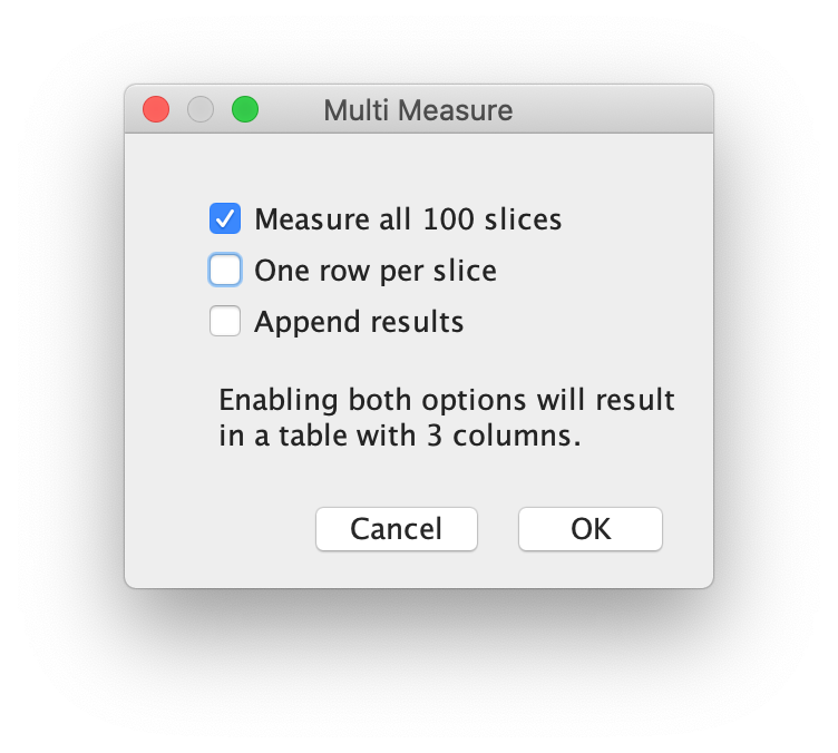
Select all three ROIs in the ROI manager. Next, quantify the intensity of all stacks by selecting on the ROI manager window:
More>> Multi Measure
Make sure to activate the checkboxes ‘Measure all 100 slices’ and deselect ‘One row per slice’ and hit OK. A screenshot of the window and the Results window is shown below:
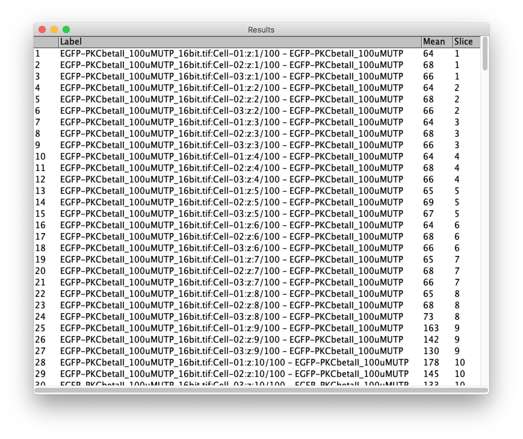
The results can be saved (in a csv file format):
File > Save As...
This file is available here as ‘Results.csv’.
Step 3: Labeling the movie
To indicate the cells that are used for the quantification, I have added labels to the GIF that was created in step 1. This can be done in ImageJ/FIJI:
Image > Stacks > Label…
An example of the settings and the result is shown in the screenshots below. Note that I have indicated that the label is only shown in the first 5 frames by setting ‘Range: 1-5’:
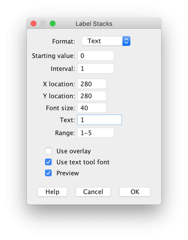
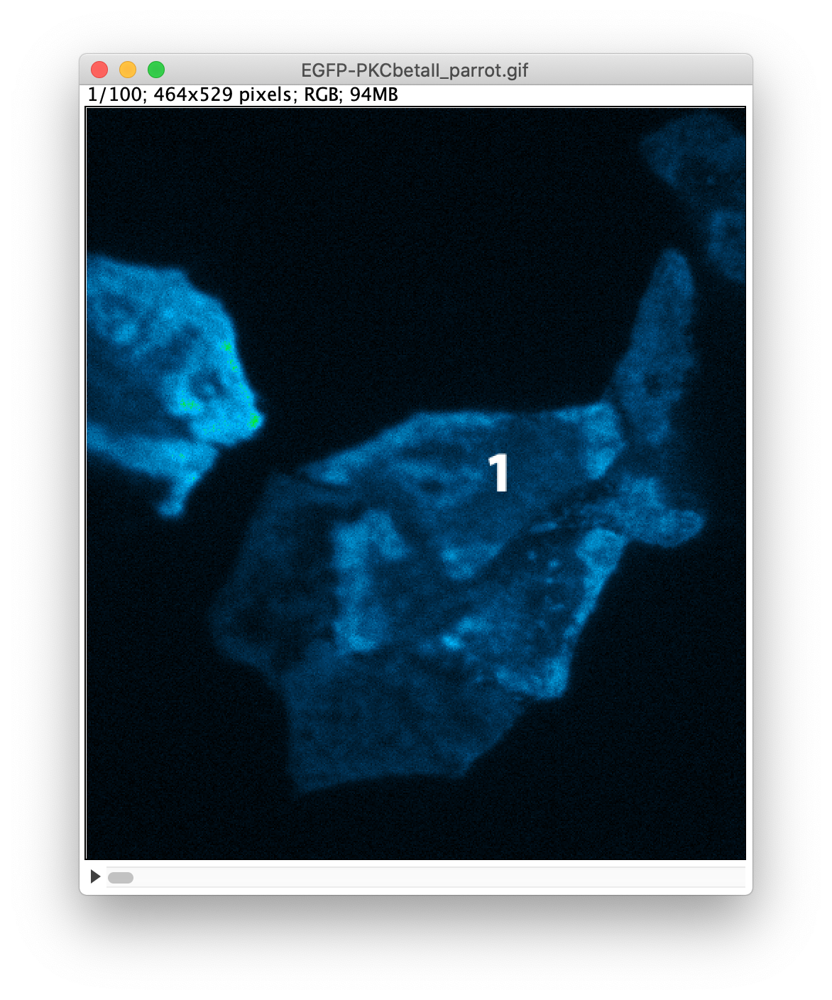
After adding the three labels, the image is saved again as a GIF. The result is available as ‘EGFP-PKC-labeled.gif’. I took note that the image has a height of 529 pixels, a number that we need later on.
Step 4: Animated Plots
For the next steps we switch to R/Rstudio. The complete script that I used is available as ‘Movie-with-plot.R’. Below, I will explain every step of the code. Running the code from the command line in Rstudio requires a bit of knowledge of R and it requires several packages that need to be installed and loaded (The ‘>’ sign indicates the prompt of the command line):
>require(ggplot2)
>require(gganimate)
>require(tidyr)
>require(dplyr)
>require(magrittr)
>require(magick)
Now we are ready to load the data that was generated in ImageJ/FIJI:
>df_results <- read.csv("Results.csv")
The CSV file has a column named ‘Label’ that we need to split in three different columns based on a colon as a delimiter. The relevant column that we need later on is ‘Sample’:
>df_tidy <- df_results %>%
  separate(Label,c("filename", "Sample","Number"),sep=':')
I rename the column ‘Slice’ to ‘Frame’, since I think that is more appropriate.
>df_tidy <- df_tidy %>% rename(Frame = Slice)
To compare intensities, it makes sense to perform a normalization (also explained in another blog). Here, I normalize the intensity data by dividing the data (per Sample) by the average of the first 5 datapoints, reflecting a baseline. The data is stored in a new column, ‘Normalized Intensity’:
>df_tidy <- df_tidy %>% group_by(Sample) %>%
  mutate(`Normalized Intensity`=Mean/mean(Mean[1:5])) %>% ungroup()
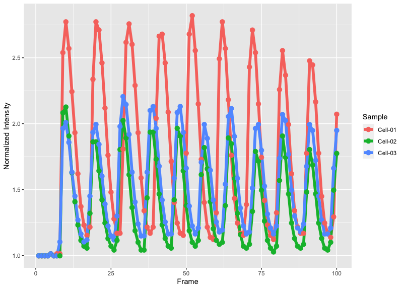
It is a good idea to inspect the data by making an ordinary plot:
>ggplot(df_tidy, aes(x=Frame, y=`Normalized Intensity`, color=Sample))+
  geom_line(size=2) + geom_point(size=3)
The plot will look like this:
Next, we generate the animated plot by adding the function transition_reveal(Frame) and we assign it to the object animated_plot:
>animated_plot <- ggplot(df_tidy,aes(x=Frame, y=`Normalized Intensity`,   color=Sample)) + geom_line(size=2) +
  geom_point(size=3) + transition_reveal(Frame)
To synchronize the movie with the animated plot, it is essential to keep the number of frames (timepoints) the same. This number is determined from the data and we will use it later on:
>nframes <- length(unique(df_tidy$Frame))
Tweaking the layout
The appearance of the default plot can be fine-tuned in many ways. Below are a few of my favorite adjustments to the standard layout. The result of each step can be inspected in Rstudio by calling the object (note that it will take some time to render the animation):
>animated_plot
-Change to a more neutral theme:
>animated_plot <- animated_plot + theme_light(base_size = 16)
-Remove the grid:
>animated_plot <- animated_plot +
  theme(panel.grid.major = element_blank(),
  panel.grid.minor = element_blank())
-Remove the legend:
>animated_plot <- animated_plot + theme(legend.position="none")
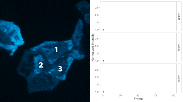
-Display separate plots (small multiples) with the ‘facet_wrap’ function and style the label of the plots:
>animated_plot <- animated_plot +
  facet_wrap(~Sample, nrow = 3, strip.position = "right") +
  theme(strip.background =element_rect(fill=NA, color='grey')) +
  theme(strip.text = element_text(colour = 'black'))
Step 5: Adding the plot to the movie
When both the animated plot and the movie are ready, they can be combined. We will adjust the dimensions of the animated plot (size and number of frames) to that of the movie. The number of frames (nframes) has already been determined. The size of the movie can be assessed in ImageJ or FIJI. In this example, we combine the movie and plot horizontally, so we need to know the height of the movie (which is 529 pixels). With these parameters we can correctly render the animated plot and assign the result to object panel_b:
>panel_b <- animate(animated_plot, nframes, height = 529, renderer = magick_renderer())
Next, we load the movie and assign it to an object panel_a:
>panel_a <- image_read("EGFP-PKC-labeled.gif")
Now, the first frames of panel_a and the first frame of panel_b can be combined:
>combined_gif <- image_append(c(panel_a[1], panel_b[1]))
This object can be displayed by entering ‘combined_gif’ in the command line:
>combined_gif
Subsequently, we add all the other frames to the new object:
>for (i in 2:nframes) {
   combined_panel <- image_append(c(panel_a[i], panel_b[i]))
   combined_gif <- c(combined_gif, combined_panel)
}
Finally, we can save the object combined_gif as a GIF:
>image_write_gif(combined_gif, 'Combined.gif')
The resulting GIF is shown below:
Final Words
The combination of a movie and plot is an attractive and informative way to visualize data from timelapse imaging. This walk-through discusses the basics and lots of additional tweaking and annotations can be done. For instance, labeling of the images can be done in R instead of ImageJ, but I haven’t really figured out how to do that. A potential improvement would be to generate a script for the entire workflow (including the labeling), since it will make it simpler to generate movies in the long run.
I hope that this tutorial is useful and I’m curious how it works for you. I’d appreciate any feedback or suggestions for improvements and I’m looking forward to watch your movies and their plot!
 (15 votes)
2 thoughts on “Crafting plots for movies”
Leave a Reply
Get involved
Create an account or log in to post your story on the Node.
Sign up for emails
Subscribe to our mailing lists.
Hey – this was fun to implement, thanks for sharing. Can you give some advice on changing the speed of the ggplot and making it relative to the GIF.
Thanks
Hi, I’m not sure that I fully understand the question, but let me try. The number of frames in the movie and the plot are the same; this will ensure synchronization. If you need to change the speed of the combined GIF, that’s probably best done with this online tool: https://ezgif.com
This website can also be used for resizing, cropping and other changes. Let me know if this did (not) answer your question.