How to… Graphical Abstract
Posted by Helena Jambor, on 27 October 2020
In my visual communication classes students increasingly want to learn how to make graphical abstracts. Below I summarized a few key points
What are Graphical abstracts?
Graphical abstracts are increasingly common to explain biomedical concepts and research results. “Summary slides” have been for long been used in talks or lectures. Today, graphical abstracts are omnipresent a thumbnail previews in online publications, and are also used in posters, on lab websites, and in research grant applications.
The key element of every graphical abstract are pictograms-like visualizations or icons. With text and arrows, the pictograms are then arranged into a sequential narrative or ‘story’. A consistent color scheme and clear layout help to orienting the audiences. Below are a few quick suggestions to help you design a graphical abstract quickly.
One main message
Before starting the design process, spend a good amount of time brainstorming the key message to get across. I personally do this by doodling on paper and discussing with peers. Without a clear main message, it will be impossible to design a good graphical abstract.
Pictograms as visual elements
Pictograms have long been used in science and in the early 20th century, Otto Neurath and Gerd Arntz started to systemically designed icons for communicating data to broad audiences. The past decade saw an explosion of new pictograms such as emoticons in social media.
A new resource for pictograms is fontawesome, a unicode-based icon library that can be installed locally as a font. The font can then be used in e.g. PowerPoint or Illustrator to directly “write” pictograms. Alternatively, pictograms can be accessed online and downloaded (svg, png). A larger collection is available at the Nounproject. Here, designers can upload icons for re-use with attribution. Scientific pictograms for free re-use are collected at the EBI reactome icon library. This site allows upload of user-designed pictograms for sharing with the scientific community.
In a graphical abstract, the pictograms used should have a similar overall appearance. Ensure that colors, line widths, and level of detail are comparable in all used icons. Best practice would be to use pictograms from one designer or one source only. And: start your own personal collection, chances are you might need them again!

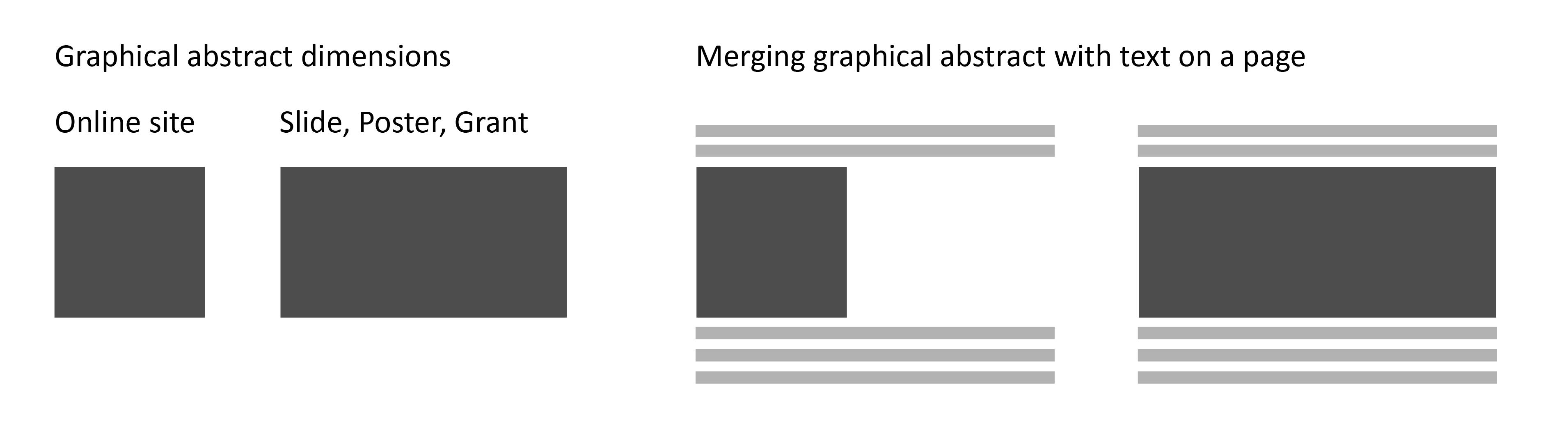
Layout: Dimensions
Layout describes the organization of visual elements on the page. First, consider the dimensions of your page: a graphical abstract for a journal website most often is square, while rectangle stretching across the entire page might be a better use of space for a graphical abstract in a grant application with limited word number.
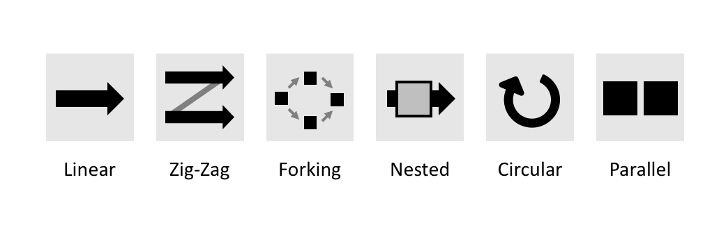
Layout: Reading direction
The layout should provide a clear entry into the graphical abstract and a clear end. Typically, we read from left to right, and top to bottom. The visual elements should be arranged along the chosen reading direction.
For depiction of linear processes, which have a clear beginning and end, organization from left to right is most suitable: time is usually shown as the independent variable on the x-axis f graphs. Linea processes may be procedures, such as a methodical pipeline, or cellular events such as cell division, embryo development, or disease progression. For depiction of cyclic events, for example daily, annual or metabolic processes, consider a circular layout; for static events, e.g. contrasting two scenarios or providing two levels of details for one scenario, consider two parallel or nested organization.
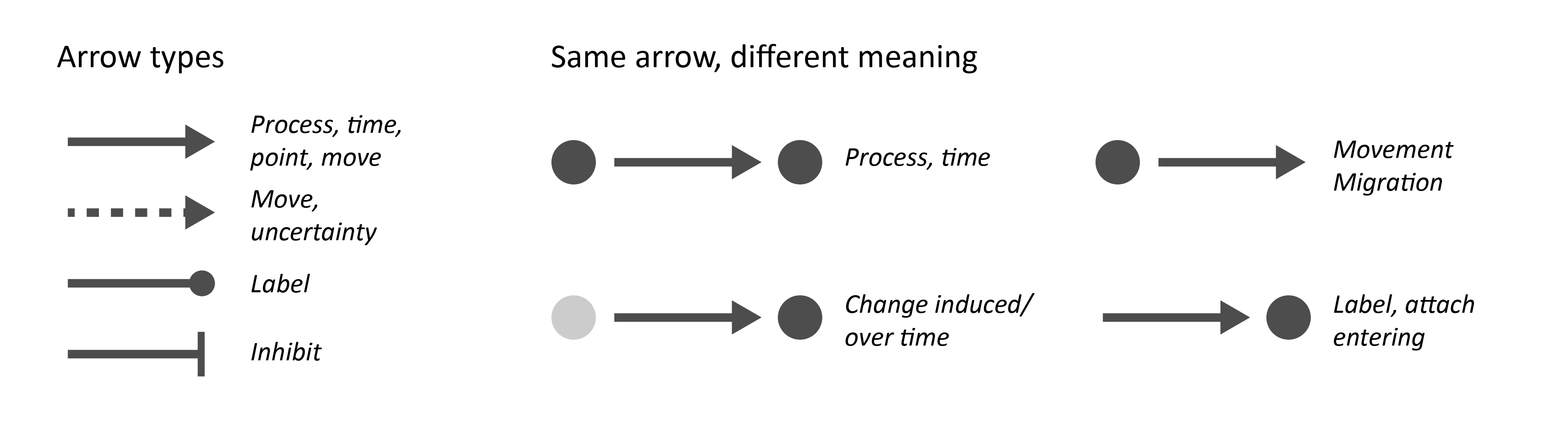
Arrows
Arrows (and lines) have several roles in graphical abstracts. First, arrows reinforce a reading direction that is already visually defined by a layout, or point out an exception from the reading direction. Second, arrows often indicate motion: a molecule passes a membrane, a cell migrates into a tissue, animals flock to food source. And third, arrows are used for labeling structures or regions of interest. Here, the arrow may be replaced by a simple line. Depending on the arrow head, the meaning can also change to showing an inhibition or forking etc.
It is important to clearly signal to the audience the intention of an arrow and, if two types of arrows are used in parallel, to contrast them visually. Note how changing the context of an arrow can also change its perceived meaning.
Text
Understanding of complex scenarios is easiest when text and visual are used in synergy (Mayer RE 2002; Hegarty, 1993). First, text is used to substitute for pictograms where these are no available (e.g. specific molecules: ‘acetylcholine’). Second, text also serves to label pictograms that are otherwise ambiguous (e.g. a circle for ‘cell’, ‘bacteria’, ‘nucleus’), Third, text also enforces the meaning of an arrow: an upward arrow could indicate ‘move up’, ‘increase’ or ‘good’, or a circular arrow could be day, year or life cycle. Last, text often provides further explanations. Here it is critical that the it remains short and without jargon and sparse abbreviations.
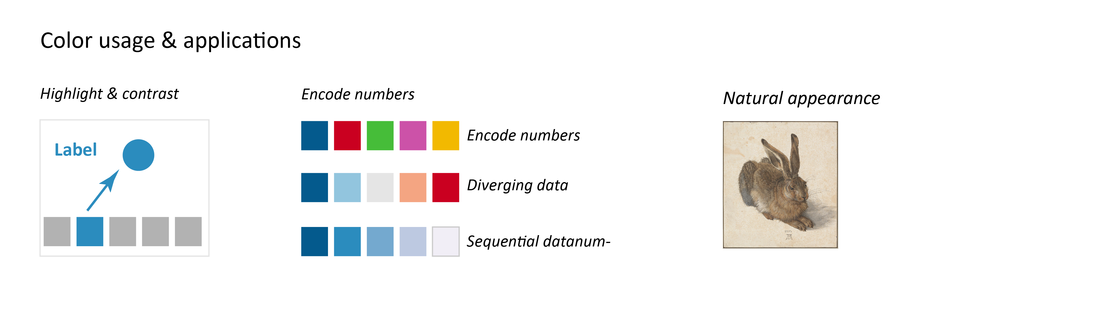
Colors
As in all visualizations, colors are used in graphical abstracts to highlight and contrast, to encode numerical data, or to show the natural appearance of a visualized object. It is key to use colors consistently. A change in color is perceived as a change in meaning. Also use color sparsely as color always draws attention of the audiences, and might eclipse the key take home message of the graphical abstract.
For picking harmonious colors schemes use e.g. http://paletton.com. Colors schemes can be based on adjacent colors to appear harmonious or on complementary colors to contrast scenarios.
Making of… Tools!
Graphical abstracts can, like a poster, be prepared with vector-design software (Illustrator, Inkjet, CorelDraw) or software for preparing slides (Powerpoint, Keynote). In both cases, pictograms can be included as images (png, tiff) or .svg files. https://biorender.com/ allows a web-based, drag-and-drop design of slides with a harmonious overall layout and biomedically relevant pictograms. For an annual fee, users can export graphical abstracts/figures in publication quality resolution.
Finish by…
Design is an iterative process of adjusting and assessing. A common problem in graphical abstracts is an unclear reading directions (Hullman and Bach): assess if your graphical abstract support a visual hierarchy with text, lines, and arrows. Often, elements are not connected to the rest of the graphical abstract, which forces readers to guess. Confusing also arises from inconsistent visual style: are your pictograms similar in detail? Do arrow with the same meaning have same appearance? Are colors used sparsely and consistently?
As always, source feedback from colleagues, ask them to tell you back what they see!
Examples
Inspiration: a lovely hand-drawn visual abstract:
https://www.sciencedirect.com/science/article/pii/S0378517319307975?via%3Dihub
Examples are also provided in the author guidelines by Elsevier: Graphical abstracts (2016). https://www.elsevier.com/authors/journal-authors/graphical-abstract
References
Tversky B. Lines, Blobs, Crosses and Arrows: Diagrammatic Communication with Schematic Figures. In: M. Anderson, P. Cheng, and V. Haarslev (Eds.): Diagrams 2000, LNAI 1889, pp. 221-230, 2000. Springer-Verlag Berlin Heidelberg.
Hullman J and Bach B. Picturing Science: Design Patterns in Graphical Abstracts. In: P. Chapman et al. (Eds.): Diagrams 2018, LNAI 10871, pp. 183–200, 2018. https://doi.org/10.1007/978-3-319-91376-6_19
Hegarty, M., Just, M.A.: Constructing mental models of machines from text and diagrams. J. Mem. Lang. 32, 717–742 (1993)
Mayer, R.E.: Multimedia learning. Psychol. Learn. Motiv. 41, 85–139 (2002)
Read more blogs helenajambor.wordpress.com/eine-seite/
or find me on twitter: @helenajambor
 (8 votes)
Get involved
Create an account or log in to post your story on the Node.
Sign up for emails
Subscribe to our mailing lists.
Read the latest Development issue
Most-read posts in May
- From comparison to mechanism: decoding heart regeneration
- A day in the life of a Reviews Editor (at Development)
- What does a Reviews Editor do?
- New evo-devo textbook ‘Eco-Evo-Devo: The Environmental Regulation of Development, Evolution, and Health’
- preLighters’ choice – A curated selection of recent preprints