Showing distributions
Posted by Helena Jambor, on 6 August 2018
When reading about co-evolution of prey and predators, I stumbled across a cute new plot type: a half boxplot, half dot plot to show data distributions.
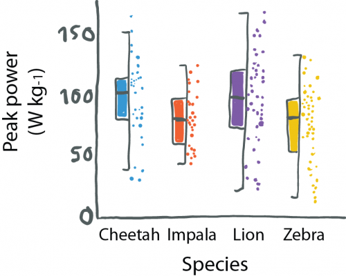
Wilson used this plot to simultaneously visualize summaries about their data (center, spread) and the actual data points. This allows us, the audience, to learn a lot about their results. That cheetahs are maybe binomially distributed and have outliers, or that zebras show a curious clustering.
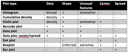
Your quick guide to distribution plots:
The half-and-half, aka dox-plot (a friend), led me to explore which visuals are commonly used for showing distributions.
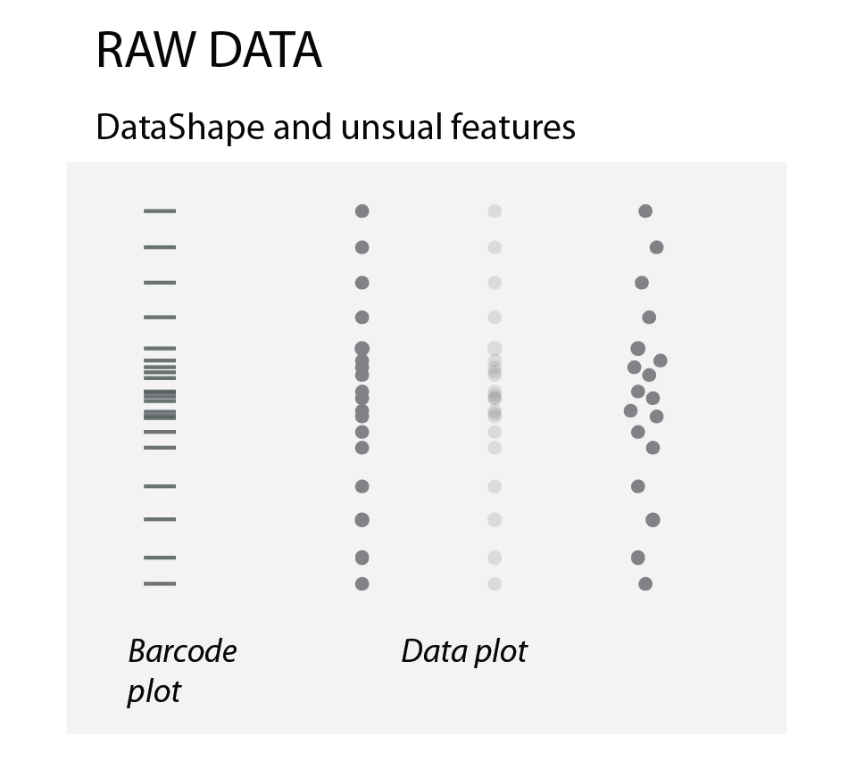
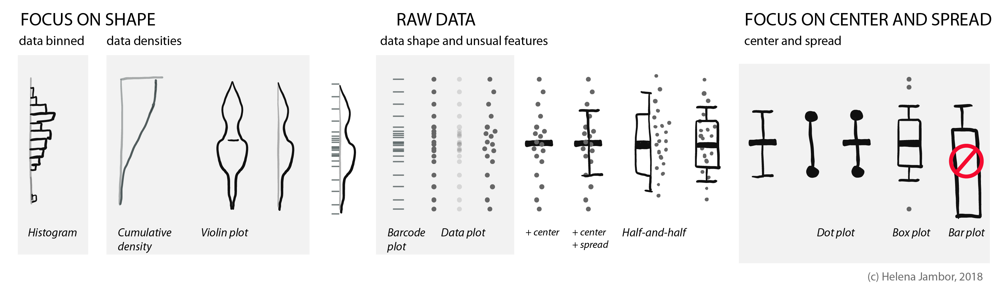
Raw data
To show how the raw data is distributed, we simply use dots or bars (as in barcode plots). When there are overlapping data points, we can use transparency or “jittering”. Jittering is distributing the data points in a given area, for increased clarity: the y-position remains the same, the x- position becomes random.
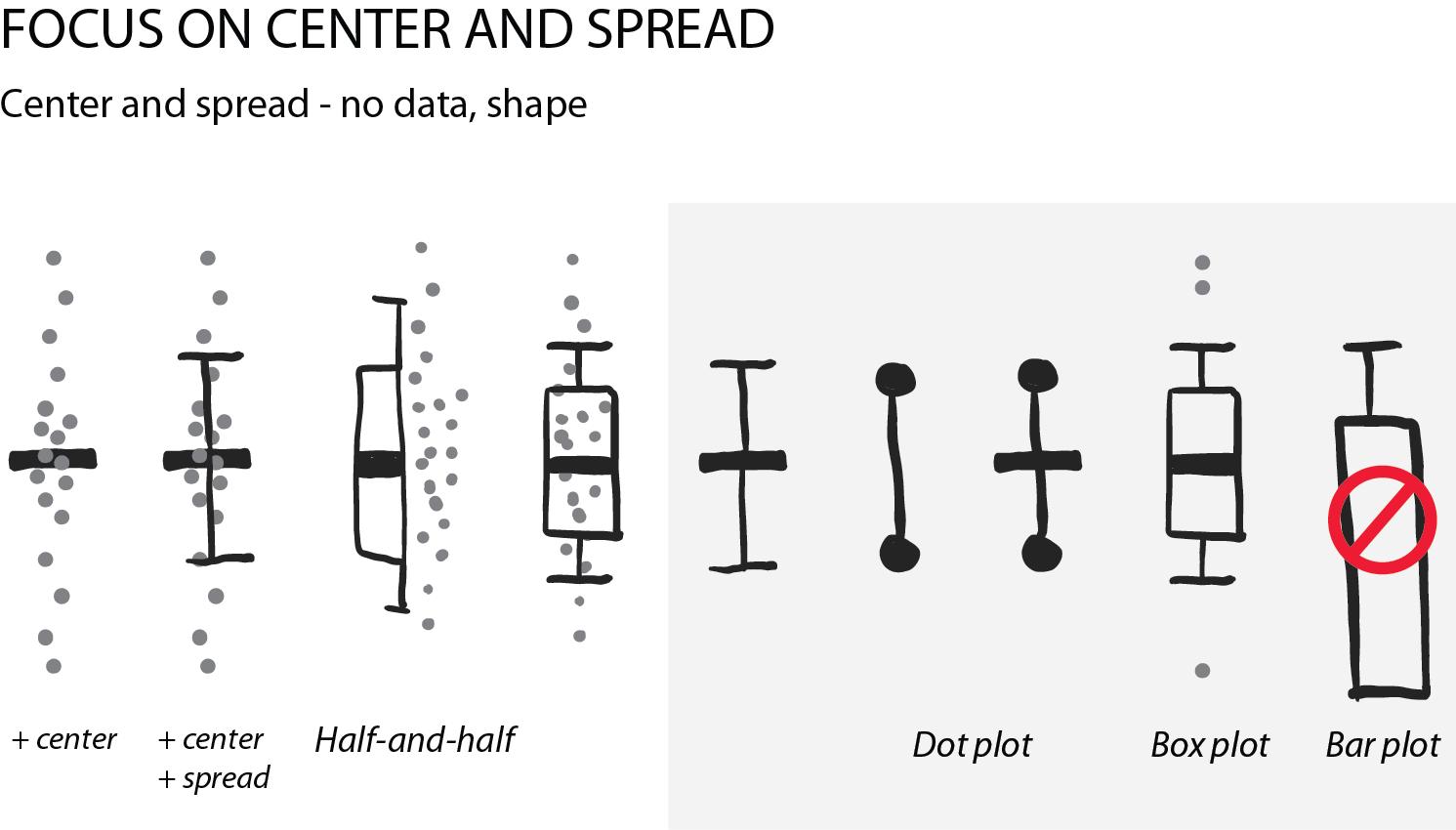
Summarizing the data: center and spread
Often, we are interested in summarizing statistics to judge and compare data. By convention the center (median) is indicated with a horizontal bar and the spread (variance, standard deviation) with vertical whiskers. Common plot types for this are the “star-wars rebel fighter”, the dot plot and boxplot. Bar plot used to be widely used, but are now banned by most journals for concealing most relevant information, so they are here only for completeness (see previous post). Very often these days I see boxplots that are overlaid with the data points – this works really well for up to 100 data points and is easy to implement with most software.
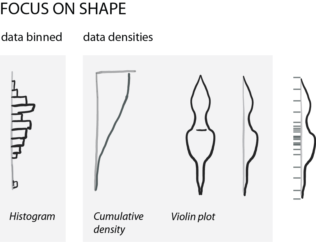
Show shape and unusual features
For normally distributed data, the center and the spread are highly informative. However, in life science we often have bimodal distributions, clusters, or gaps. Then boxplots become very insufficient and might even conceal interesting aspects (if not outright be misleading).
For faithfully showing distributions, histograms have a long history. Here, one has to be very careful with choosing bin sizes: too large or too small bins can greatly distort the histogram shape and result in a misleading chart. Choosing bin sizes is a science in itself, for details see wikipedia – but basically, it again depends on the data shape and sampling depth.
An alternative to histograms are density plots. Density plots show how data are distributed. They become very useful for large data sets. For large data sets individual points can’t be visualized anymore and the eye can’t anymore judge spread intuitively. A rather recent but so far “happy marriage” is the violin plot. Violin plots are a fusion of the boxplot and its summary statistics, with the density/shape of the data (Hintze and Nelson, 1998 doi: 10.1080/00031305.1998.10480559).
Further reading in a recent preLIGHT by Gautam Dey!
Pro and cons of different plot types:
All figures in one for teaching:
 (11 votes)
4 thoughts on “Showing distributions”
Leave a Reply
Get involved
Create an account or log in to post your story on the Node.
Sign up for emails
Subscribe to our mailing lists.
Nice post ! One thing to keep in mind I think is to avoid over-interpretation of the raw data. When you say “that zebras show a curious clustering” it shows more a weakness of raw points to me because our brain tends to seek for patterns of all kinds even when they don’t have any statistical relevance/significance.
Hi Nicolas, yes, you are absolutely right and my sentence was a little bit tongue-in-cheek. There probably should be an article about how much our brain is forcing us to believe patterns exist – and how this can lead to mis- interpretation of data!
Best
Helena
Great post, it reminded me of the ‘Raincloud’ plots, described here:
https://micahallen.org/2018/03/15/introducing-raincloud-plots/
Oh yes, someone send them to me too, maybe you? They are density + data + boxplot, right? What do you think – I only really read the density there and see that it is supported by the data, but the data points are to me just decoration.