Leaving the bar in five steps
Posted by Joachim Goedhart, on 24 March 2017
Introduction
Graphs (or charts or plots) are often used for the display and summary of data. They are essential tools for the communication of results in presentations or manuscripts. One particular type of graph, the bar graph, is often used to quantitatively compare (multiple) conditions. The earliest known example of a bar graph, dates from the 18th century and its invention is attributed to William Playfair (Beniger and Robyn, 1978).
Proper use of bar graphs includes the display of counts or frequencies of observations, where the length of the bar represents the corresponding value. However, bar graphs are often used to summarise multiple data-points per condition. In this situation, the top of the bar equals the mean value calculated from the data points. The bars are often accompanied by error bars that show the standard error of the mean (SEM) or standard deviation (SD). This type of plot has been coined a ‘dynamite plunger plot’ (footnote 1) for its cartoonesque similarity to a detonator for explosives. The dynamite plunger plot has gained wide popularity and is often the graph of choice to summarise and present data in presentations or manuscripts. One of the reasons for the popularity of bar graphs is that these are easily made by (commercial) software.
Bar graphs are bad graphs
A bar graph with errors bars has one major problem: it conceals the underlying data. Bar graphs do not allow independent interpretation of the data by the reader of a manuscript or the audience of a presentation. Moreover, it is often unclear what the error bars depict (SEM, SD or 95% confidence intervals). Many related issues that add to the notion that bar graphs are bad graphs and should no longer be used have been repeatedly addressed by others, for example here, here, here and here. Clearly, the bar graph is in need of a complete make-over.
Steps toward transparent data presentation
To improve transparency in data presentation, several features of the bar graph can be modified. Below, I describe 5 steps, departing from a standard bar graph, that aim at improving transparency and interpretation. Each step changes one aspect, as shown in figure 1 (or in this animated version). A motivation of each step is presented below.
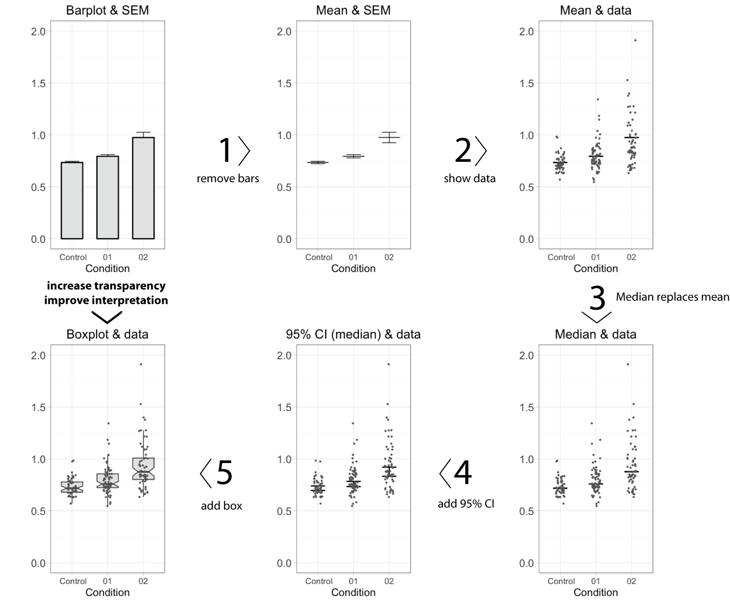
- Remove the bar
The top horizontal line of the bar equals the average value. This single value is the only information carried by the bar, and therefore the bar (except for the horizontal line) can be removed without loosing information. This action increases the data-ink ratio, which is defined by E.R.Tufte, pioneer in the field of data visualization, as the ratio of non-erasable data-ink to the total amount of ink used in the graph. To further increase the data-ink ratio, a single dot and two lines could be used to depict the average and error margins, respectively.
- Show the data
Error bars may not give a realistic impression of the variability of the data. The error bars conceal outliers, multi-component distributions and asymmetric distributions. Therefore, it is more informative to show the actual data-points as dots. When many data-points need to be plotted (>100) the dots may start to overlap. This can be remedied by using semi-transparent dots. Alternative ways to show dense distributions is by using a bean plot or a sinaplot, which is an improved version of the violin plot.
- Replace the mean by the median
The mean value, indicated by the horizontal line, informs us about the central value of the data. Mean values, however, are sensitive to outliers and may not be a proper representative of the central value in case of asymmetric data distributions. An alternative, robust measures of the central value is the median (or geometric mean). The median is not sensitive to outliers and equals the mean when the data adheres to a normal distribution. In case of asymmetric distributions, the median is a better indicator of a typical value of the data. Since the median is a more robust indicator of the central value of the data, the mean should be replaced by the median. When the number of data points, n, is low (typically n<10), it is recommended to show only the data and median, omitting any error bars. So, in case of low n, the make-over of the bar graph is completed at this stage.
- Add 95% Confidence intervals
In the original bar graph, the error bars depicted the standard error of the mean (SEM). There are convincing arguments that 95% confidence intervals (95%CI) are better suited to summarise variation. First, the 95%CI give a more realistic impression of the variation in the data than SEM. Second, the 95%CI can be used for statistical inference by eye, i.e. judging whether two conditions are statistically different. If the 95%CI do not overlap, this implies a statistical difference. In this example, the 95%CI around the median is calculated by using the equation from McGill et al. (1978). An alternative strategy that can be used to calculate the 95%CI of the median is by bootstrapping, allowing for asymmetric 95%CI.
- Add a box
Instead of the median (or mean) with 95%CI, a notched boxplot can be shown to summarise the data and allow for inferences. By convention, the center of the boxplot indicates the median, and the limits of the box define the interquartile range (IQR = middle 50% of the data). The notches indicate the 95%CI around the median, which is an estimation of the interval that includes the population median in 95 out of 100 cases, if the experiment was performed multiple times. The whiskers (shown here as vertical lines) can be defined in multiple ways. Here, we used the Tukey definition, i.e. the whiskers extend to data points that are no further from the box than 1.5*IQR.
Conclusion
The bar plot has infested the scientific literature. The disadvantages of bar plots have been documented by many. Several good alternatives for bar plots exist, which allow for a more transparent presentation of results and enable inferences by eye. The end result of the complete make-over of the bar graph that is presented here is the box&dotplot. The box&dotplot differs in at least five essential aspects from a bar graph with error bars and is a major improvement since the box&dotplot reports data in a transparent way, enabling independent interpretation of the results by others. In an era of increased focus on open science and data availability it is time to step away from the bar graph and expose the data.
Methods
The graphs were made using R/Rstudio with the library ggplot2. The data and code is available at http://doi.org/10.5281/zenodo.375944. A user-friendly alternative to create dotplots and boxplots online is provided by boxplotR.
Shout-out
I am grateful to anyone sharing code, the twitter community and to my colleagues for comments and the exchange of thoughts.
Footnote 1: I attempted to trace the origin of the term ‘dynamite plunger plot’ (with help from Gordon Drummond and Sarah Vowler). One of its first documented uses was in the books ”How to display data” and “Statistics at Square One“, co-authored by M.J.Campbell. In an e-mail, replying to my inquiry, Michael J Campbell states “I am pretty sure I thought of the phrase, since that is what they look like, but others may also have thought of it.”
 (20 votes)
2 thoughts on “Leaving the bar in five steps”
Leave a Reply
Get involved
Create an account or log in to post your story on the Node.
Sign up for emails
Subscribe to our mailing lists.
Joachim,
Thanks for the write-up; I think these types of graph work well for both publications and presentations, as they are a) more clear to the reader, and b) more professional in appearance.
I do have one general question. The mantra I heard in stats class was ‘the data must be shown in a way that mirrors the statistics’. So no showing frequency data while testing raw numbers for example.
In the example above – I typically use mean and standard deviation for graphs where treatments are compared with t-test or ANOVA, as those statistics are making use of mean and variance (in which case, standard deviation is not ideal but can be converted to variance if the sample size is given). In your example, how would you indicate statistical comparisons in the figure, or how would you address them in the text?
Dear Doug,
Thanks for the comments. I prefer not to perform statistical tests or list p-values (if you must, list them as exact numbers). The notches of the boxplot, indicating the 95% confidence interval of the median can be used for statistical inference. This is quite well explained by George Cumming:
https://www.ncbi.nlm.nih.gov/pubmed/15740449
Instead of the focus on significant differences, the more interesting thing to know is the effect size (what is the magnitude of the difference?). The effect size (and 95%CI) is usually not calculated when comparing conditions, but that may change….