Visualizing data with R/ggplot2 – It’s about time
Posted by Joachim Goedhart, on 31 May 2018
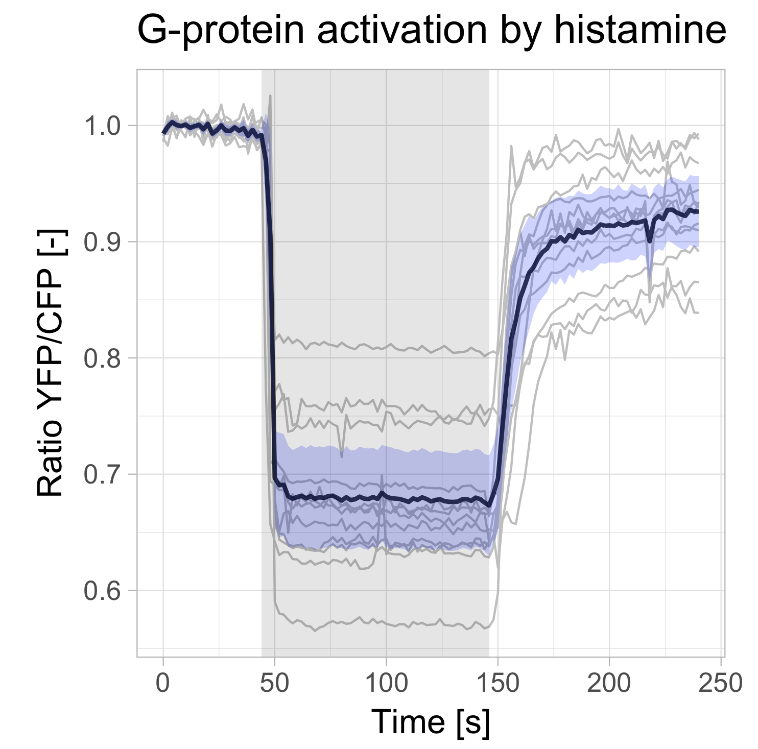
The visualization of temporal data by line graphs has been documented and popularized by William Playfair in the 18th century (Aigner et al, 2011; Beniger and Robyn, 1978). Today, time-dependent changes are still depicted by line graphs and ideally accompanied by a measure of uncertainty (Marx, 2013). Below, I provide a ‘walk-through’ for generating such a plot with R/ggplot2 to visualize data from time-series. For convenience, example data and an R-script that performs all steps is available here. The data that I used is from Mastop et al (2017). After the make-over with ggplot2, the graph looks like this:
Some time ago, my favorite (commercial) software package for making graphs was no longer supported due to a system upgrade. So I was looking for a powerful and flexible alternative for data visualization. I ended up with R and ggplot2. First of all, the elegant data visualization delivered by the ggplot2 package is hard to beat. On top of that, it is completely free and it has a large user base. The biggest obstacle (in my experience) was getting used to the tidy data format that is needed as input. The conversion of ordinary, spreadsheet type data into long, tidy data is dealt with in a previous blog, and again briefly explained below. Before we start, we need to load two packages (these need to be installed first):
>require(tidyr)
>require(ggplot2)
The example data (available here) is read from a file in csv format into a dataframe (you need to set the “working directory” to match the location of the file):
>df_wide <- read.csv("FRET-ratio-wide.csv", na.strings = "")
To find out wat the first six rows of the dataframe look like type:
>head(df_wide)
which returns:
  Time    cell.1    cell.2    cell.3    cell.4 ...   cell.12
1    0 0.9935818 0.9965762 0.9907055 0.9938881 ... 0.9859260
2    2 0.9972606 0.9979417 1.0014600 1.0041020 ... 1.0080610
3    4 1.0109350 1.0076620 1.0023690 1.0011580 ... 0.9993525
4    6 0.9959134 1.0018910 1.0034930 1.0011640 ... 0.9900663
5    8 0.9970548 0.9971041 0.9957852 1.0019420 ... 0.9979293
6   10 1.0038560 1.0018550 0.9897691 0.9976327 ... 1.0042090
The first column defines time and the other columns have data of individual cells corresponding to each of the timepoints. This data has a spreadsheet format, which is also named a ‘wide’ format. The first step is to convert it into a tidy data format, which is ‘long’. For details see my previous blog. The command to convert the df_wide dataframe into a tidy dataframe, df_tidy, is:
>df_tidy <- gather(df_wide, Cell, Ratio, -Time)
You can have a look at the first six rows of the dataframe to see what has changed:
>head(df_tidy)
Generating a basic graph
Once the data in the df_tidy dataframe is in long/tidy format, it can be used to generate a graph. The minimal instructions needed to display a graph are:
- The dataframe that is used as input: df_tidy
- The data used for the x-axis: Time
- The data used for the y-axis: Ratio
To plot the data with minimal instructions use the function qplot():
>qplot(data=df_tidy, x=Time, y=Ratio)
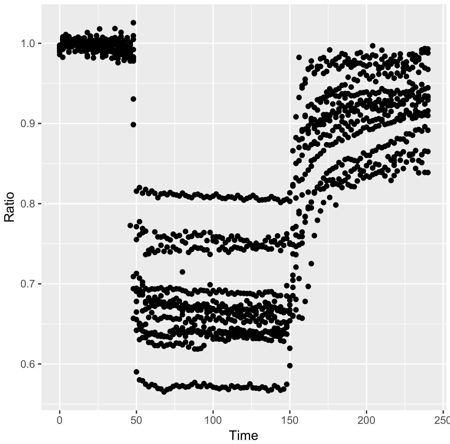
Points/dots are used by default, but for these data lines are more appropriate:
>qplot(data=df_tidy, x=Time, y=Ratio, geom='line')
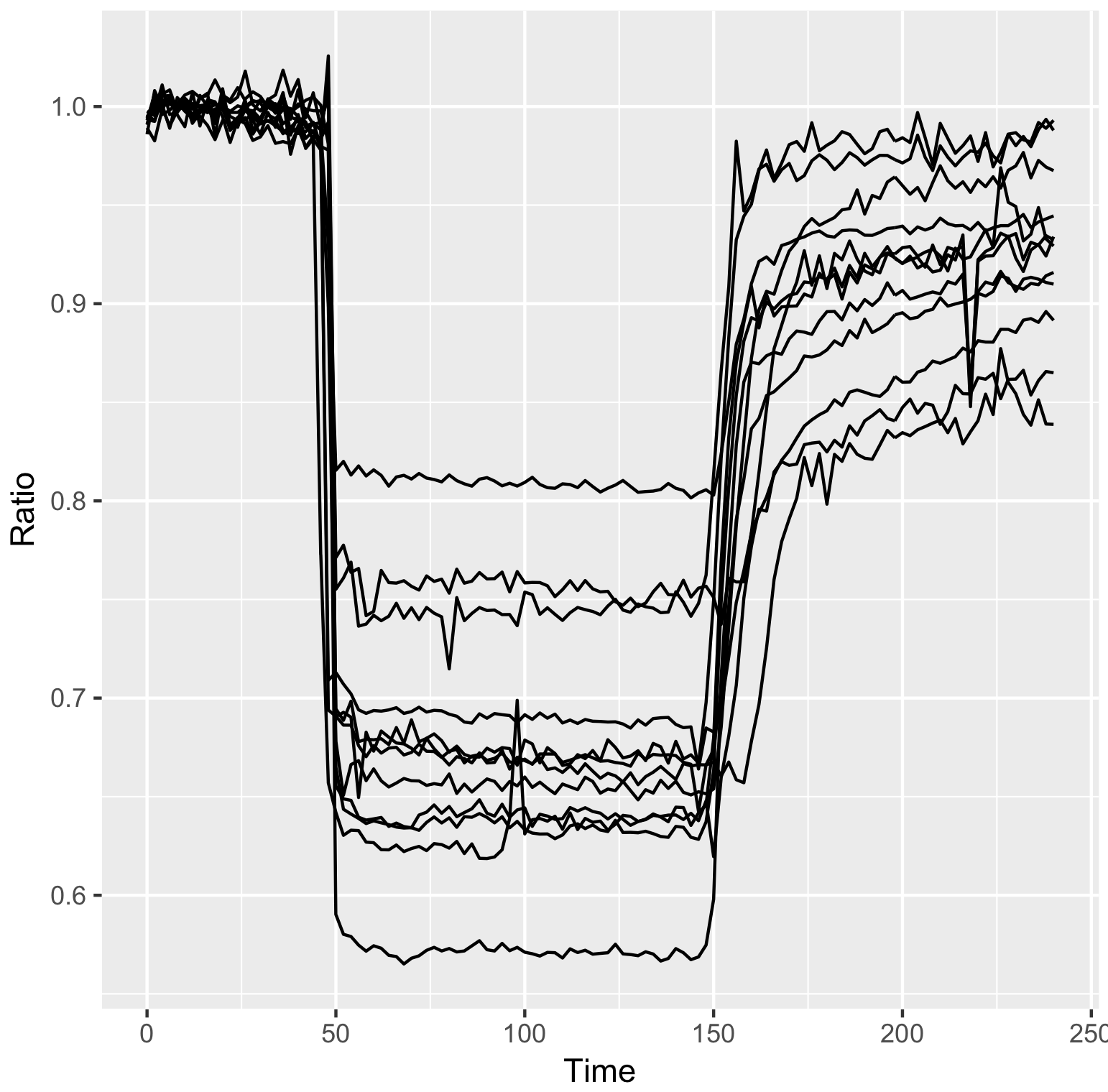
In the resulting graph all the datapoints are connected by lines, and the curves are not grouped per cell. To imrove this use:
>qplot(data=df_tidy, x=Time, y=Ratio, geom='line', group=Cell)
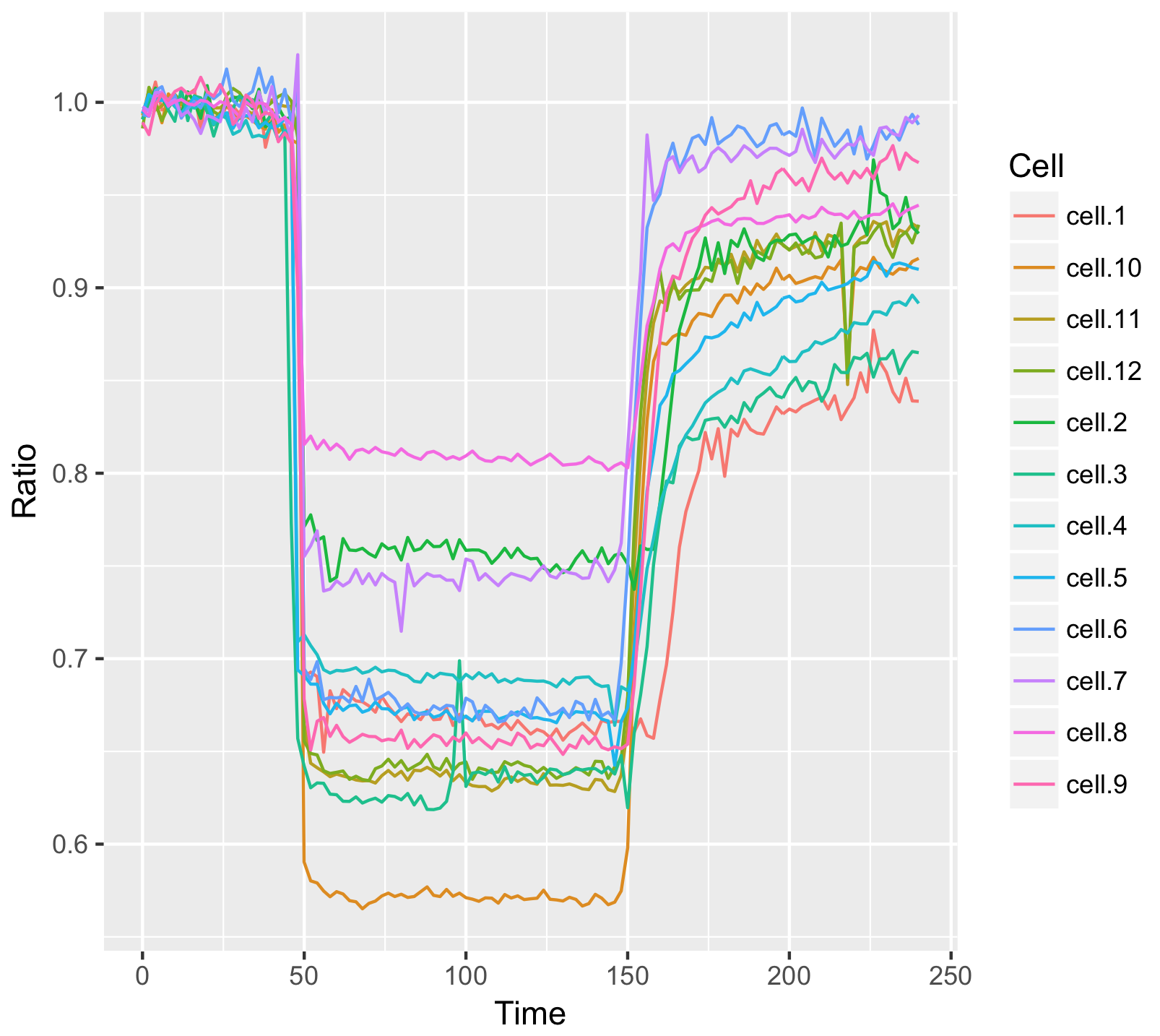
Or goup the data per cell and give the data from each cell a different color:
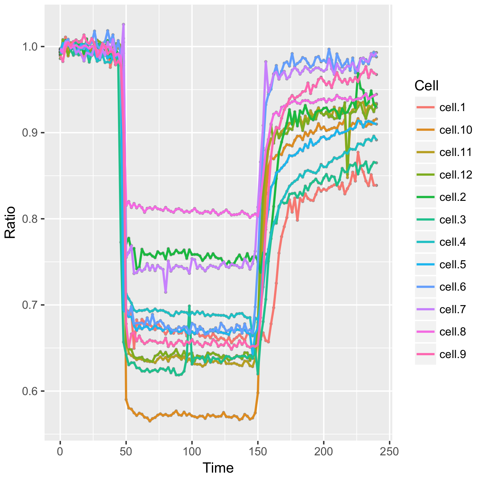
>qplot(data=df_tidy, x=Time, y=Ratio, geom='line', color=Cell)
Generating a graph with layers
The ‘qplot’ command provides a quick way to plot the data. To have a bit more control we turn to ggplot2(). The syntax is slightly more complex, but it allows to plot multiple layers. To reproduce what was done with qplot we need:
>ggplot(df_tidy, aes(x=Time, y=Ratio)) + geom_line(aes(color=Cell))
The aes() function is used for mapping “aesthetics”. The aesthetics specify how the variables from the dataframe are used to visualise those variables. In this case ‘Time’ is used for mapping the data onto the x-axis and ‘Ratio’ is used to map the data onto the y-axis. The geom_line() function specifies that the data is shown as a line. Inside geom_line(), aes(color=Cell) specifies that the line of each cell is mapped to a unique color. For more information on aesthetics and examples see this book chapter.
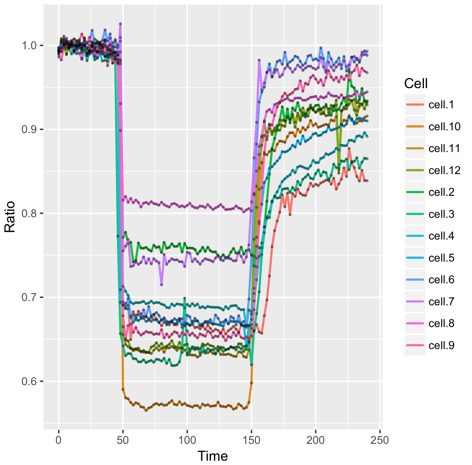
The geom_line() function defines that the data are displayed as lines. We can add another layer with a different geometric shape, geom_point(), to show the individual data as dots (in this example the dots will not have a color, since no aesthetic mapping is specified for geom_point):
>ggplot(df_tidy, aes(x=Time, y=Ratio))+ geom_line(aes(color=Cell))+ geom_point()
The thickness of the lines and the size of the dots (size) and transparency of the dots (alpha) can be adjusted, for example:
>ggplot(df_tidy, aes(x=Time, y=Ratio)) + geom_line(aes(color=Cell), size=0.8) +
  geom_point(size = 1, alpha=0.3)
The appearance of the plot depends on the sequence in which the layers are added. This is defined by the sequence in which the objects are added, i.e. the first object defines the first layer and next object is added on top. For instance, this code will generate a plot in which the lines are on top of the points:
> ggplot(df_tidy, aes(x=Time, y=Ratio)) + geom_point(alpha=0.3, size=0.5) +
   geom_line(aes(color=Cell), size=0.8)
To generate a plot in which the points are visible, we define them as the last object and hence, they are added on top of the lines:
>ggplot(df_tidy, aes(x=Time, y=Ratio)) + geom_line(aes(color=Cell), size=0.8) +
   geom_point(alpha=0.3, size=0.5)
Generating a graph with data summaries
The option of adding layers allows the addition of a summary of the data, for instance the average, or data for various types of error bars. To achieve this, a dataframe is defined to store the summary statistics:
>df_summary <- data.frame(Time=df_wide$Time, n=tapply(df_tidy$Ratio, df_tidy$Time, length), mean=tapply(df_tidy$Ratio, df_tidy$Time, mean))
This will generate a df_summary dataframe that has the average signal and the number of samples per time point.
To add the standard deviation and standard error of the mean:
> df_summary$sd <- tapply(df_tidy$Ratio, df_tidy$Time, sd)

> df_summary$sem <- df_summary$sd/sqrt(df_summary$n-1)
> head(df_summary)
Returns:
   Time  n      mean          sd          sem
0     0 12 0.9929529 0.003313210 0.0009989706
2     2 12 0.9989194 0.007343436 0.0022141294
4     4 12 1.0027538 0.004194419 0.0012646648
6     6 12 1.0002915 0.006014562 0.0018134585
8     8 12 0.9994599 0.002606858 0.0007859971
10   10 12 1.0007186 0.004189333 0.0012631315
Finally, we add the lower and upper bound of the 95% confidence interval:
>df_summary$CI_lower <- df_summary$mean + qt((1-0.95)/2, df=df_summary$n-1)*df_summary$sem
>df_summary$CI_upper <- df_summary$mean - qt((1-0.95)/2, df=df_summary$n-1)*df_summary$sem
We can start by plotting the average response:
>ggplot(df_summary, aes(x=Time, y=mean)) +
   geom_line(data=df_summary, aes(x=Time, y=mean), size=1, alpha=0.8)

We add the 95% confidence interval (95%CI) as a measure of uncertainty. Here we employ geom_ribbon() to draw a band that captures the 95%CI. To this end, we employ aes() inside geom_ribbon() to specify that the upper and lower limits of the confidence interval from df_summary define the borders of the ribbon. (Note that alternative methods that display uncertainty may be considered.)
>ggplot(df_summary, aes(x=Time, y=mean)) +
   geom_line(size=1, alpha=0.8) +
   geom_ribbon(aes(ymin=CI_lower, ymax=CI_upper) ,fill="blue", alpha=0.2)
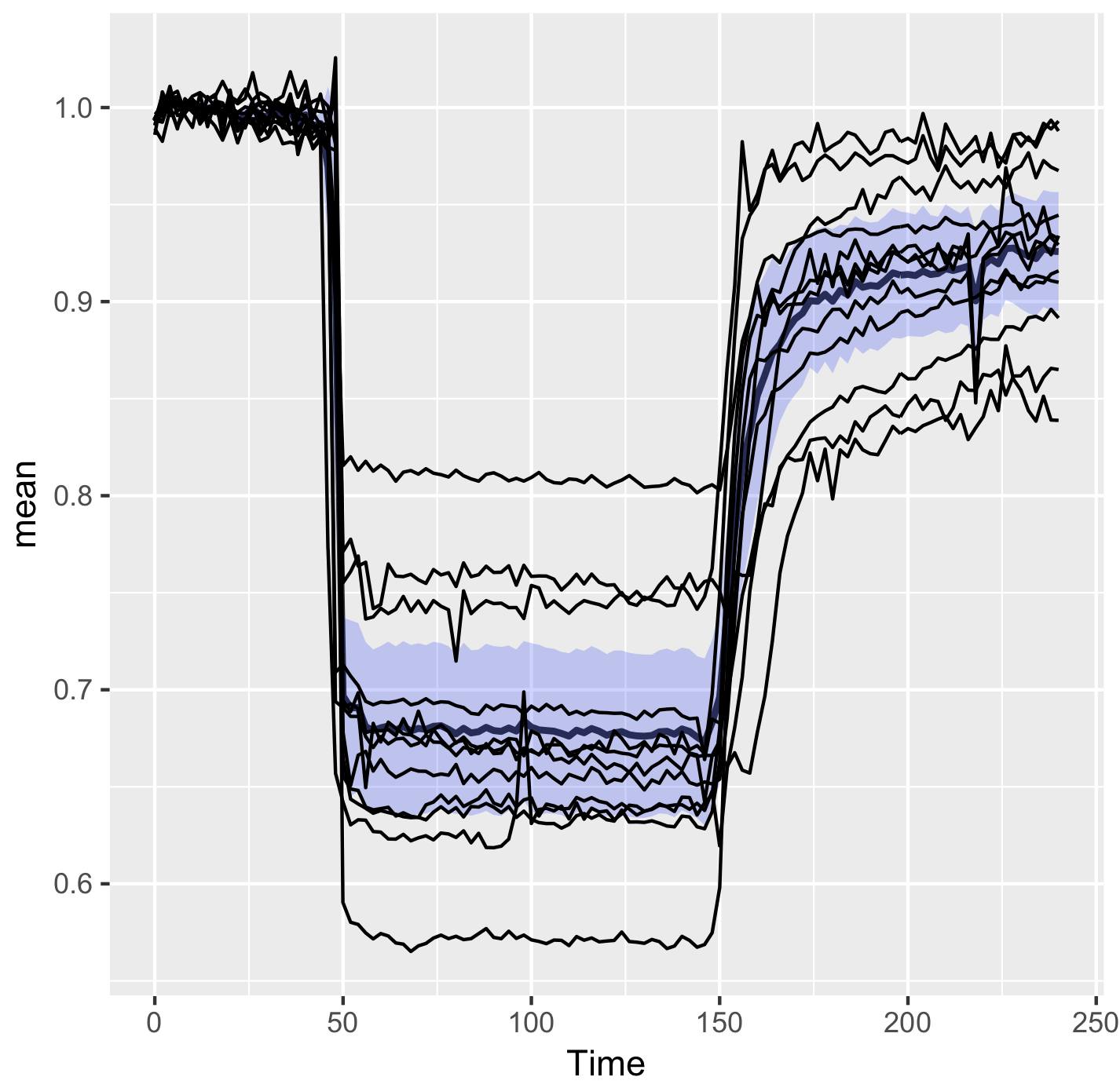
The resulting figure only shows the data summary. Since it can be valuable to show the underlying data we will plot the data from individual cells as well. These data are present in another dataframe, yet it is possible to add these data to another layer. To demonstrate this, the original data from the individual measurements (from df_tidy) is added:
>ggplot(df_summary, aes(x=Time, y=mean)) +
   geom_line(size=1, alpha=0.8) +
   geom_ribbon(aes(ymin=CI_lower, ymax=CI_upper), fill="blue", alpha=0.2) +
   geom_line(data=df_tidy, aes(x=Time, y=Ratio, group=Cell))
Improving the presentation and annotation of the graph
The graph shown above displays all the data of interest, but it looks cluttered. In the final session the lay-out and annotation will be changed to improve the visualization and communication of the results (see also ‘Graphics for Communication’).
To make the individual data less pronounced, the lines are plotted in grey. Also, the graph looks better if the ribbon of the 95%CI is drawn on top, so we move the grey lines to the first layer and plot the average and 95%CI on top of that:
>ggplot(df_summary, aes(x=Time, y=mean)) +
   geom_line(data=df_tidy, aes(x=Time, y=Ratio, group=Cell), color="grey") +
   geom_line(size=1, alpha=0.8) +
   geom_ribbon(aes(ymin=CI_lower, ymax=CI_upper) ,fill="blue", alpha=0.2)
To indicate where we performed a manipulation of the system another layer can be added. In this experiment a stimulus was added at t=44 and inhibited at t=146. To reflect this, we add a grey box with the function annotate():
>ggplot(df_summary, aes(x=Time, y=mean)) +
   geom_line(data=df_tidy, aes(x=Time, y=Ratio, group=Cell), color="grey") +
   geom_line(size=1, alpha=0.8) +
   geom_ribbon(aes(ymin=CI_lower, ymax=CI_upper) ,fill="blue", alpha=0.2) +
   annotate("rect",xmin=44,xmax=146,ymin=-Inf,ymax=Inf, alpha=0.1, fill="black")
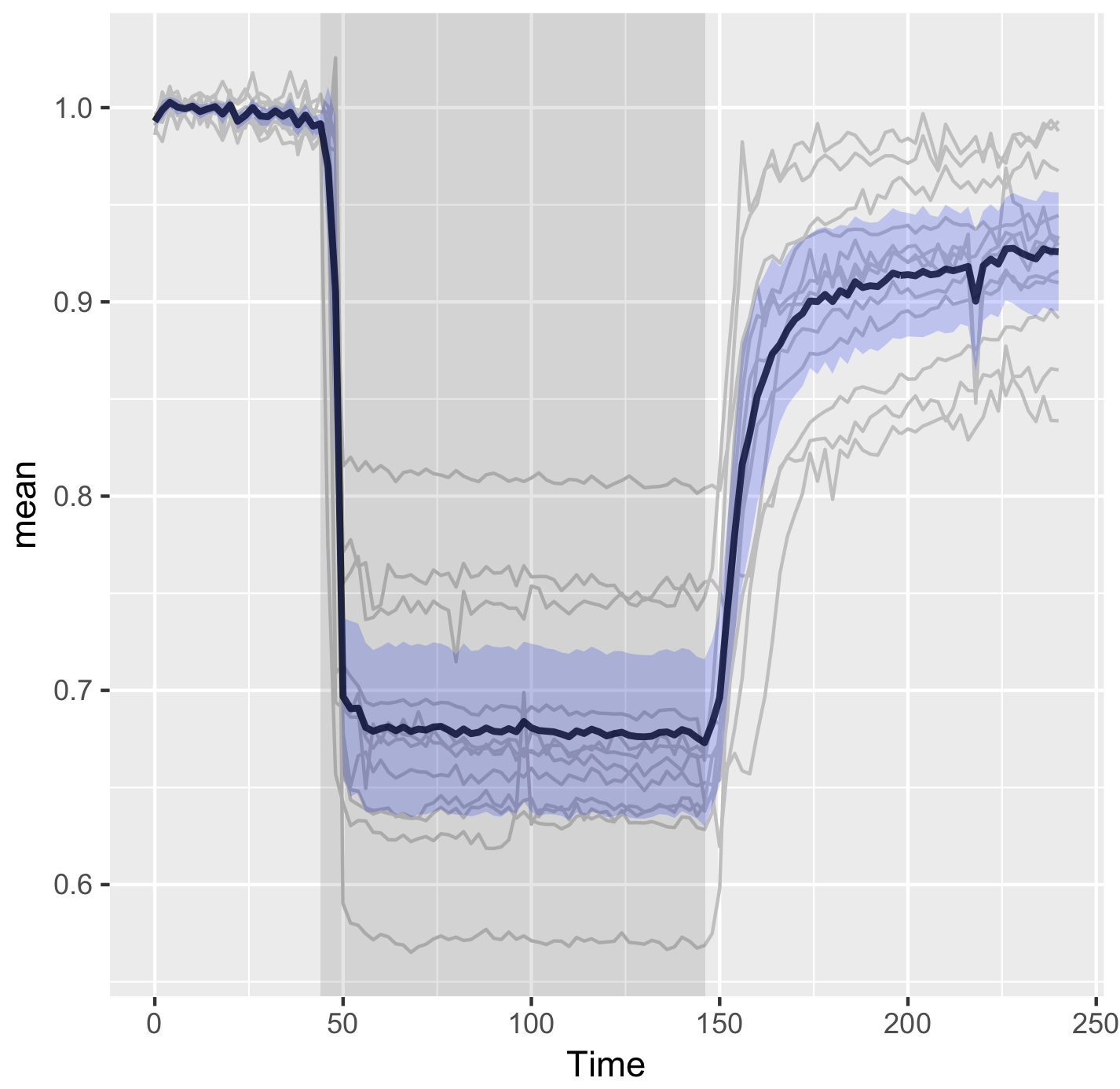
To change the default grey background from the area of the graph, the ‘theme’ can be changed:
>ggplot(df_summary, aes(x=Time, y=mean)) +
   geom_line(data=df_tidy, aes(x=Time, y=Ratio, group=Cell), color="grey") +
   geom_line(size=1, alpha=0.8) +
   geom_ribbon(aes(ymin=CI_lower, ymax=CI_upper) ,fill="blue", alpha=0.2) +
   annotate("rect",xmin=44,xmax=146,ymin=-Inf,ymax=Inf,alpha=0.1,fill="black")+
   theme_light(base_size = 16)
Finally, we change the labels of the x- and y-axis and add a title:
>ggplot(df_summary, aes(x=Time, y=mean)) +
   geom_line(data=df_tidy, aes(x=Time, y=Ratio, group=Cell), color="grey") +
   geom_line(size=1, alpha=0.8) +
   geom_ribbon(aes(ymin=CI_lower, ymax=CI_upper) ,fill="blue", alpha=0.2) +
   annotate("rect",xmin=44,xmax=146,ymin=-Inf,ymax=Inf,alpha=0.1,fill="black") +
   theme_light(base_size = 16) +
   ylab("Ratio YFP/CFP [-]") + xlab("Time [s]") +
   ggtitle("G-protein activation by histamine")

Final words
The end results is a nice and clean visualization of the data, which is an improvement over the original visualization (made with commercial software, see insets of figure 6 from Mastop et al (2017)). The instruction to plot graphs with ggplot() usually consists of several different functions and may be daunting at first sight. I hope that providing this ‘walk-through’ that shows how to build a graph layer-by-layer lowers the barrier to start using R/ggplot2 for visualization of (temporal) data.
Acknowledgments: Thanks to Franka van der Linden, Eike Mahlandt and Jenny Olins for testing and debugging the code.
 (14 votes)
One thought on “Visualizing data with R/ggplot2 – It’s about time”
Leave a Reply
Get involved
Create an account or log in to post your story on the Node.
Sign up for emails
Subscribe to our mailing lists.
Read the latest Development issue
Most-read posts in June
- From Posters to Parades: Inside Woodstock.Bio² & Night Science Conference by Natanella Eliaz
- Visualizing with Vibes: Potential and Pitfalls by Joachim Goedhart
- Cellular Worlds – An Art Exhibition Inspired by Microscopic Universes
- On the Shape of Life: meeting report, SFBD meeting 2025 by Girish Kale
- #DanioDigest (May 2025) by Kevin Thiessen
- Squishing jellies!! by Yamini Ravichandran
- Lab meeting with the Silveira Lab
- SciArt profile: Henning Falk
A follow-up of this blog describes how to plot multiple datasets: https://thenode.biologists.com/visualizing-data-one-more-time/education/