Data Visualization with Flying Colors
Posted by Joachim Goedhart, on 29 August 2019
The importance of barrier-free use of colors in images and graphs has been highlighted in letters to editors (Miall, 2007), papers (Geissbuehler and Lasser, 2013, Levine, 2009), editorials (anonymous, 2007), columns (Wong, 2011) and on numerous web pages. One of the recommendations is to use a color blindness simulator. Having a color vision deficiency myself, I cannot judge whether these tools work well. Nevertheless, a trial-and-error based approach seems rather inefficient. Instead, the use of (a number of) default color blind friendly palettes would be much more straightforward. For instance, green and magenta colors are the default choice for the production of color blind friendly overlays of fluorescence images. Below, I discuss a number of color palettes that are suitable for coloring graphical elements in plots. I think that people with a color vision deficiency would benefit from the implementation of these palettes in software for data visualization.
Qualitative color schemes
A quantitative color scheme is used when numbers need to be represented by colors. This conversion is done with a Look-Up Table (LUT). For more information on (colorblind-friendly) LUTs see this blog and this paper. Here, I talk about qualitative color schemes, which use colors to label different categories. The number of distinct categories define the number of unique colors that are needed. Ideally, these color can be distinguished by everybody.
For up to four categories, it is rather straightforward to come up with a set of colors that are easy to distinguish. Still, it does make sense to choose the colors from a color blind friendly color scheme. When 5-8 colors are needed to uniquely label different categories, it is a considerable challenge to find a suitable color palette. Beyond 8, it is close to impossible to find colors that can be readily distinguished. In these cases, alternative labeling methods are recommended. Below, several color blind friendly qualitative color schemes are described and four of those are shown in figure 1.
Color blind friendly palettes
Masataka Okabe and Kei Ito have proposed a palette of 8 colors on their website Color Universal Design (CUD). This palette is a “Set of colors that is unambiguous both to colorblinds and non-colorblinds”. The use of this palette is supported by others (Wong, 2011; Levine, 2009) and it is the default scale for the book “Fundamentals of Data Visualization” by Claus Wilke.
Martin Krzywinski has a website with 12- and 15-color palettes that offer more choices. Personally, I have difficulty with distinguishing several of these colors. Also, it is recommended to use no more than 8 different colors. Therefore, these palettes will not be taken along.
Paul Tol has created several qualitative color schemes that are color blind friendly. These palettes have 5-10 colors (including grey) and vary in darkness.
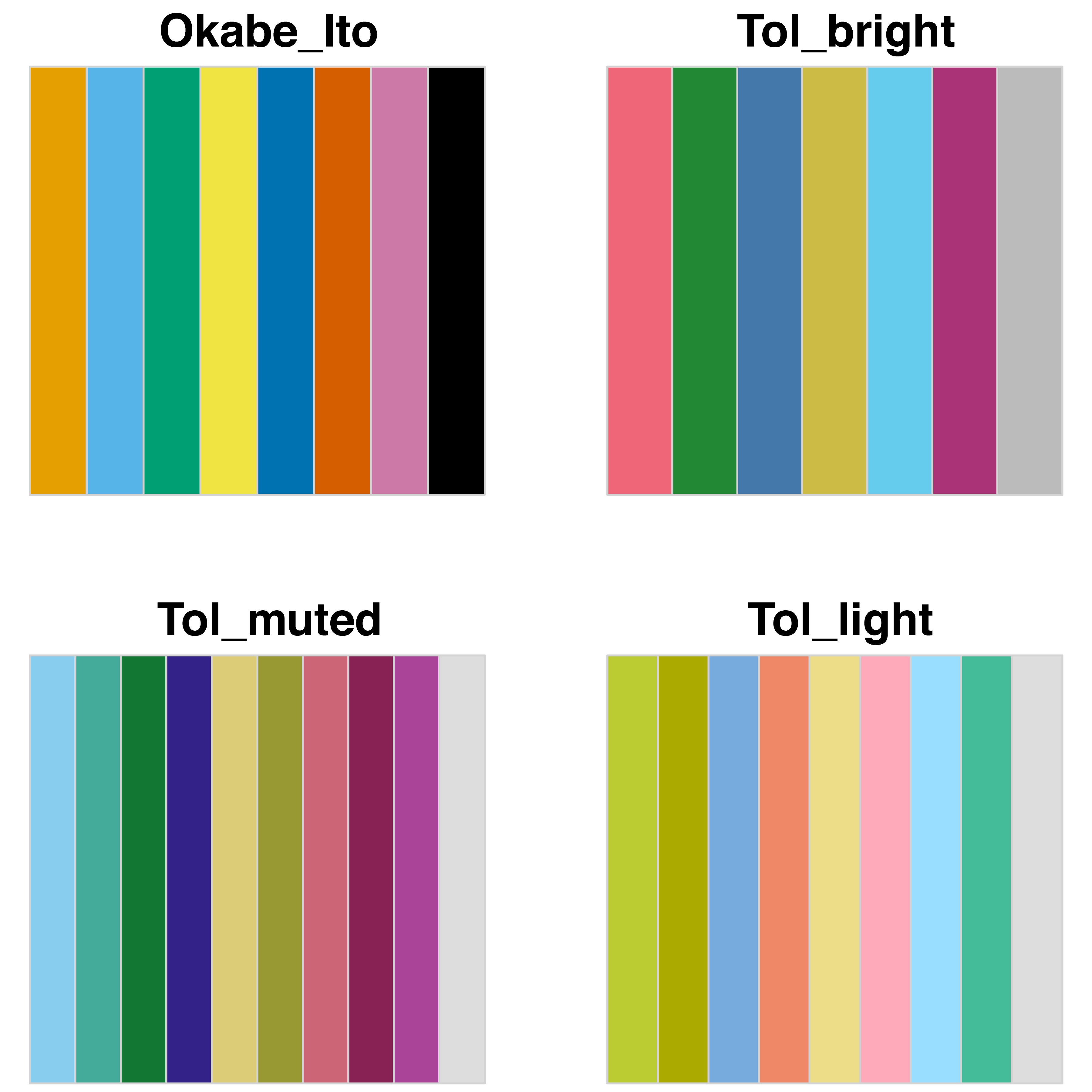
Figure 1: An overview of qualitative, color blind friendly palettes. The figure was produced with an R-script that defines and plots the palettes (doi: 10.5281/zenodo.3381072).
Choosing a color scheme
Which of the palettes is the best? This is hard to say for several reasons. Colors look different when printed, shown on a screen, or projected with a beamer. Next to this, size, structure and position of the objects will determine whether the categories can be distinguished. As a consequence, it is probably impossible to come up with a single universal color palette. I think that the palette designed by Okabe&Ito is a good first choice. Still, it is a good idea to see how different palettes perform when they are used in realistic data visualizations. As an example, figure 2 shows four plots in which the different color blind friendly palettes are used to label 6 lines.
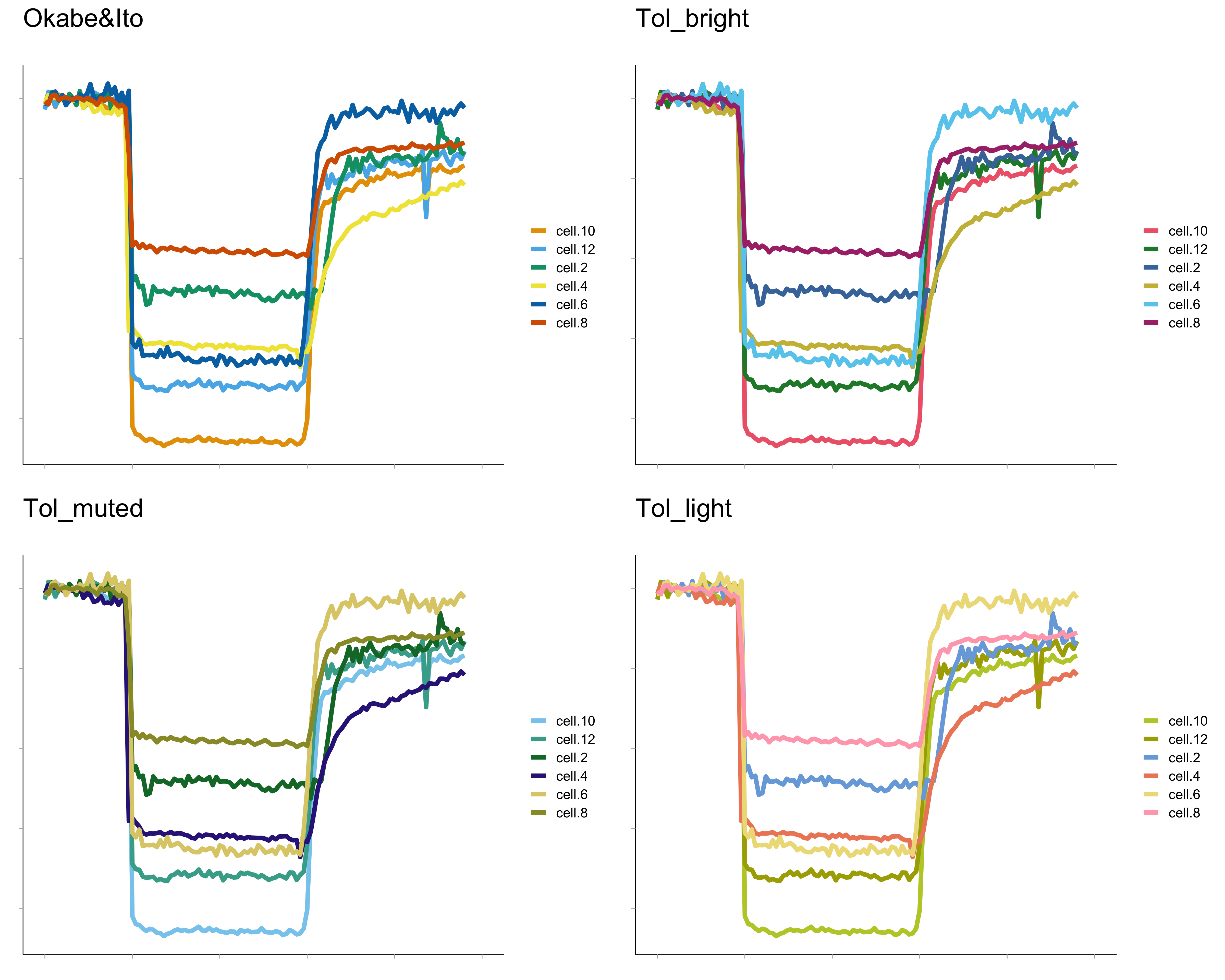
Figure 2: The color palettes shown in figure 1 are used to uniquely label 6 different lines in a realistic data visualization. The graphs are with made with PlotTwist.
The palettes shown in figure 1 are implemented in the webtool PlotTwist (Goedhart, 2019). PlotTwist is a freely available online tool for plotting and annotating time-series data. It enables anyone to experiment with the color blind friendly palettes and apply them to lineplots. I encourage you to share your opinion on these (or any other) palettes and how they perform (especially if you have a color vision deficiency). To do so, you may leave a reply below or share your thoughts on twitter. Ultimately, I hope to see more data visualizations that pass a color blindness test with flying colors.
Recommendations
I will end with some recommendations aimed at improving graphs that use color:
-Use a color blind friendly palette by default.
-Use thick lines or large symbols to make it easier to correctly identify and map the color to a legend.
-In addition to colors, consider the use of patterns or labels to distinguish between categories.
-Use a maximum of 8 different colors for the labeling of different categories.
-Use a legend that shows the colors, instead of referring to the colors by their name.
-Keep the legend that explains the mapping of the colors close to the actual data.
 (33 votes)
2 thoughts on “Data Visualization with Flying Colors”
Leave a Reply
Get involved
Create an account or log in to post your story on the Node.
Sign up for emails
Subscribe to our mailing lists.
This was a really helpful and informative guide, thank you! Also, thanks a lot for pointing me towards the Claus Wilke book on Data Visualisation, I’ve been searching for something similar to help me produce better figures!
Thank you. As a medical doctor*, clinical and basic scientist, and medical informaticist who cannot differentiate blue from purple, some purples from some pinks, and have trouble w/ dark reds & greens, and dark yellows & greens I truly appreciate ANY and ALL efforts to help.
I am befuddled why journals accept non-color-blind safe diagrams (particularly those which only have a color = category/variable in a box where color is the only thing conveying meaning), applications don’t have colorblind safe palates AS DEFAULTS. I have to manually enter the RGB values into palates (both for data display, but also for text editors/IDEs which use font+color to indicate semantics).
*Yes, histology and pathology were hard–but if you do a *good* job w/ H&E or Gram stating (I have my own method) I can get by well enough!