Visualizing data with R/ggplot2 – One more time
Posted by Joachim Goedhart, on 26 June 2018
Experiments are rarely performed in isolation. Usually, several conditions are compared in parallel or sequential experiments. This experimental strategy also applies to time-dependent data, e.g. from timelapse imaging. So, naturally, after I published a ‘walk-through for plotting temporal data using R and ggplot2, I was immediately asked how to plot two (or more) sets of data in the same graph.
To respond to this request, I made a ‘walk-through’ for generating graphs that visualize temporal changes in signal from multiple experimental conditions. This tutorial will also feature some of the ‘tidy tools’ (footnote 1) that are designed to work on tidy data. The final figure, shown below, displays the changes in the activities of three (separately measured) Rho GTPases that occur after stimulating endothelial cells. For more background on the experiments, the reader is referred to the paper by Reinhard et al (2017).

Combining and plotting the data from different conditions
First we will read the experimental data from three different csv files (available here) and put them into three separate dataframes:
> df1 <- read.csv("Fig3_Rac_S1P.csv")
> df2 <- read.csv("Fig3_Rho_S1P.csv")
> df3 <- read.csv("Fig3_Cdc42_S1P.csv")
Each dataframe holds the information from a particular experimental condition. In this example, the dataframes contain the activities of three Rho GTPases, Rac, Rho or Cdc42, measured over time. Each dataframe has data from individual cells organized by columns. The values that were measured are a “Ratio” that is a result of a FRET imaging experiment. The first column is a record of the Time. Let’s see what a typical dataframe looks like:
> head(df1)
returns:
       Time    Cell.1    Cell.2    Cell.3    Cell.4    Cell.5 ...
1 0.0000000 1.0012160 1.0026460 1.0022090 0.9917870 0.9935569 ...
2 0.1666667 0.9994997 0.9928106 0.9997658 0.9975348 1.0018910 ...
3 0.3333333 0.9908362 0.9964057 0.9905094 0.9946743 0.9961497 ...
4 0.5000000 0.9991967 0.9972504 0.9972806 1.0074250 1.0060510 ...
5 0.6666667 1.0093450 1.0109910 1.0103590 1.0084080 1.0022130 ...
6 0.8333333 0.9941078 0.9940830 0.9990720 1.0181230 1.0110220 ...
To keep track of which data or values belong to which experimental condition (Rac, Rho or Cdc42) we assign a unique identifier to each of the dataframes. To achieve this, we add another column, named “id”, that identifies the condition:
> df1$id <- "Rac"
> df2$id <- "Rho"
> df3$id <- "Cdc42"
The next step is to merge the datasets into one dataframe. The function bind_rows() from the ‘dplyr’ package will do this (to learn how to load the package see footnote 1):
>df_merged <- bind_rows(df1,df2,df3)
Columns with identical names will be merged. For instance, there will be one column with “Time” and another column named “id” that indicates which experiment was performed. The remaining columns list the values that were obtained during the measurements for each of the cells.
The dataframes from the different conditions have data from different numbers of cells. Therefore, there will be columns that are not completely filled with values. For instance, the dataframe df1 (Rac) has data from 32 cells, while df2 (Rho) has only data from 12 cells. As a result, the df_merged dataframe has a column “Cell.32” that has only data from the Rac experiment and not for Rho and Cdc42. These empty fields (or “missing values”) will be replaced in the dataframe by “NA”.
To do all of the above at once for all csv files that are present in a defined working directory, this R script can be used.
The merged dataframe, df_merged, is still in a wide, spreadsheet format. To convert it into a tidy format (as has been detailled here) we use the function gather() from ‘tidyr’. Since the “Time” and “id” column do not need to be changed, they are excluded from the gathering operation by the preceding minus sign:
>df_tidy <- gather(df_merged, Cell, Ratio, -id,-Time)
To check the result use:
> head(df_tidy)
which returns:
       Time  id   Cell     Ratio
1 0.0000000 Rac Cell.1 1.0012160
2 0.1666667 Rac Cell.1 0.9994997
3 0.3333333 Rac Cell.1 0.9908362
4 0.5000000 Rac Cell.1 0.9991967
5 0.6666667 Rac Cell.1 1.0093450
6 0.8333333 Rac Cell.1 0.9941078
Previously, we used a similar tidy dataframe to draw the lines from individual cells and color those according to the column “Cell”:
>ggplot(df_tidy, aes(x=Time, y=Ratio)) + geom_line(aes(color=Cell))
This results in:
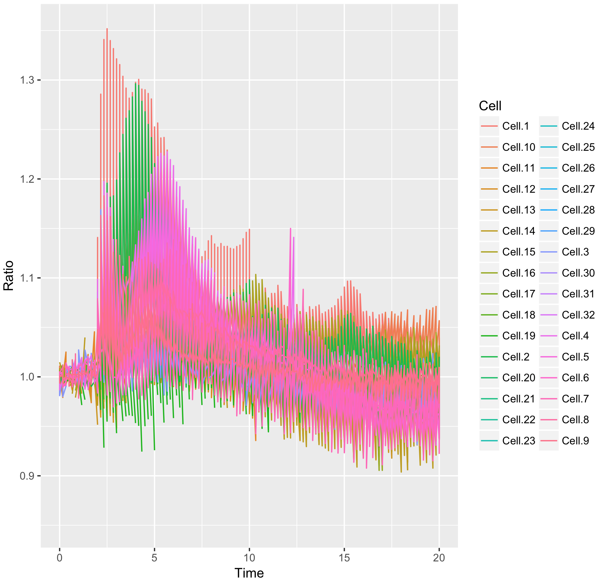
This graph looks like a mess. The reason is that in the column “Cell”, the factor Cell.1 can be linked to the Rho, Rac and Cdc42 dataset.
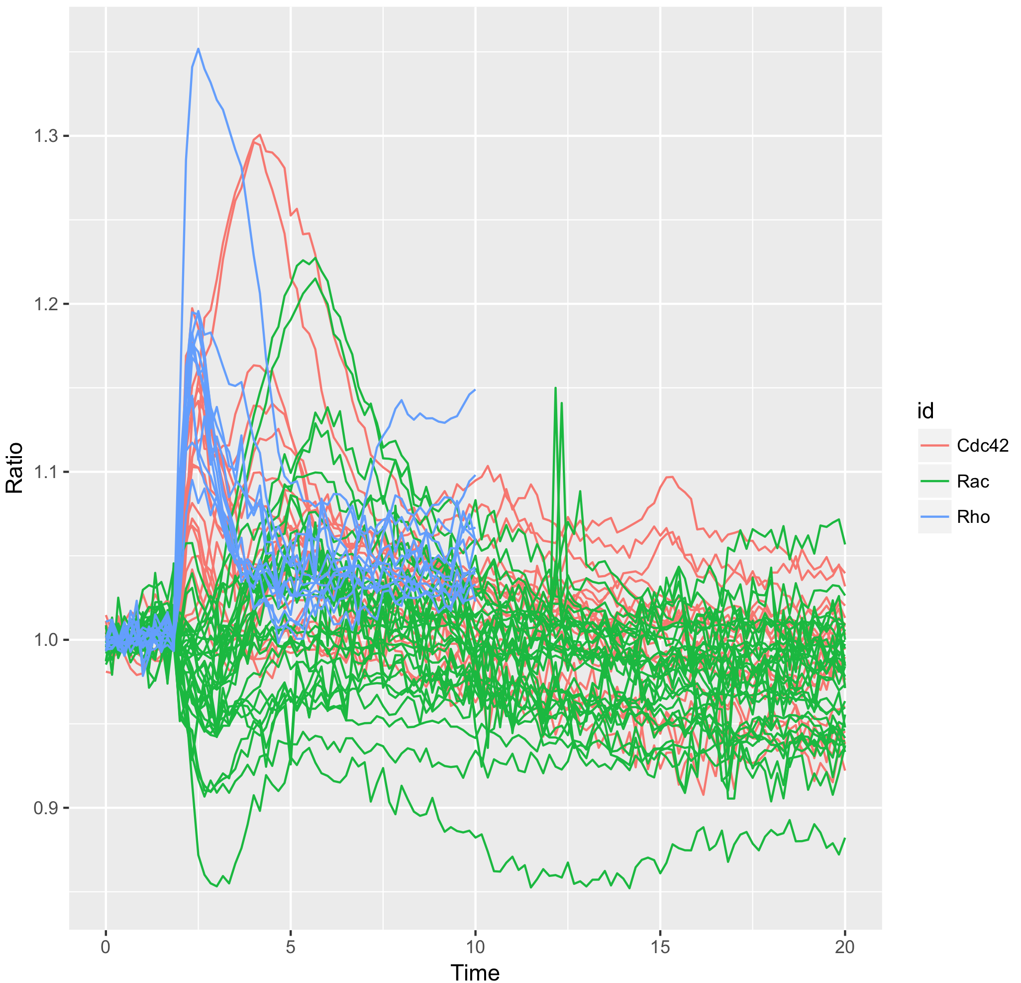
To solve this, we need to define another column that has a unique identifier for each cell from every condition. One way to achieve this, is by combining the string in the “id” column with the string in the “Cell” column by using unite(). The new, combined string (connected with an underscore) is placed into a new column named “unique_id”:
>df_tidy <- unite(df_tidy, unique_id, c(id, Cell), sep="_", remove = FALSE)
Now, each sample can be grouped according to the “unique_id” to draw the line correctly:
>ggplot(df_tidy, aes(x=Time, y=Ratio)) +
  geom_line(aes(color=Cell, group=unique_id))
To obtain a plot that shows all the individual traces colored according to the experimental condition we can use:
>ggplot(df_tidy, aes(x=Time, y=Ratio)) + geom_line(aes(color=id, group=unique_id))
Generating a graph with data summaries
The next thing you may want to do is to calculate statistics. In the previous post it was explained how to calculate the mean value for each time point by using base R code.
Here, the same calculation will not give a meaningful result, since each time point has data from the three different conditions. To calculate the mean for each condition (defined by “id”) for each of the time points I will use the function group_by(). This function is part of the “tidyverse”, a set of tools that work well on tidy data (footnote 2).
Another feature of tidy tools is the “pipe” which is encoded by %>%. It basically moves the result from a function onto the next function. The advantage is that we can concatenate a number of functions that are still understandable by humans because the sequence of events can be read from left to right (footnote 3).
So, to calculate the mean value we first group the data by “Time” and “id”. Next, we calculate the number of points (n) and the average (mean) with the function summarise(). The pipe is used to perform the operations all at once. The result is assigned to a new dataframe, df_tidy_mean:
>df_tidy_mean <- df_tidy %>%
    group_by(Time, id) %>%
    summarise(n = n(), mean=mean(Ratio))
To show what the first rows of the dataframe looks like we use head():
> head(df_tidy_mean)
which yields:
# A tibble: 6 x 4
# Groups:   Time [2]
Time id        n   mean
<dbl> <chr> <int>  <dbl>
1 0     Cdc42    32 NA
2 0     Rac      32  0.998
3 0     Rho      32 NA
4 0.167 Cdc42    32 NA
5 0.167 Rac      32  0.999
6 0.167 Rho      32 NA
The data structure of the result is a “tibble“, which is a next-generation dataframe. In this walk-through, we use tibbles in the same way as dataframes and do not make a distinction.
The content of df_tidy_mean is not what we want, since each row has n=32 observations and the mean of de conditions “Cdc42” and “Rho” returns “NA”. We know that n=32 for Rho cannot be right, since there are only 12 cells cells measured for Rho. The n=32 for each of the conditions is due to the “NA” values in the columns that are counted as well. This also explains why we do not see a proper mean for “Cdc42” and “Rho”. To address this issue, we need to get rid of the missing values in the “Ratio” column. We can do this by adding another function to the previously used command that uses the filter() function to only select “Ratio” values that are not “NA”:
> df_tidy_mean <- df_tidy %>%
    filter(!is.na(Ratio)) %>%
    group_by(Time, id) %>%
    summarise(n = n(), mean=mean(Ratio))
Let’s see if that worked out the way we want:
> head(df_tidy_mean)
# A tibble: 6 x 4
# Groups:   Time [2]
Time id        n  mean
<dbl> <chr> <int> <dbl>
1 0     Cdc42    19 1.00
2 0     Rac      32 0.998
3 0     Rho      12 0.998
4 0.167 Cdc42    19 0.995
5 0.167 Rac      32 0.999
6 0.167 Rho      12 1.00
This gives the expected result. The condition “Rho” has n=12 and the condition “Rac” has n=32. These number of samples match with the data (csv files) that were supplied as input. We can continue to add some more useful statistics to the dataframe:
>df_tidy_mean <- df_tidy %>%
    filter(!is.na(Ratio)) %>%
    group_by(Time, id) %>%
    summarise(n = n(),
           mean = mean(Ratio),
         median = median(Ratio),
             sd = sd(Ratio))
Finally, we will use the function mutate() to calculate the inferential statistics, i.e. the standard error of the mean and the 95% confidence interval of the mean:
>df_tidy_mean <- df_tidy %>%
    filter(!is.na(Ratio)) %>%
    group_by(Time, id) %>%
    summarise(n = n(),
           mean = mean(Ratio),
         median = median(Ratio),
             sd = sd(Ratio)) %>%
    mutate(sem = sd / sqrt(n - 1),
      CI_lower = mean + qt((1-0.95)/2, n - 1) * sem,
      CI_upper = mean - qt((1-0.95)/2, n - 1) * sem)
Now, the df_tidy_mean dataframe has all the summary data that we need, for each condition (“id”) and for each time point.
> head(df_tidy_mean)
# A tibble: 6 x 9
# Groups:   Time [2]
Time id        n  mean median      sd      sem CI_lower CI_upper
<dbl> <chr> <int> <dbl>  <dbl>   <dbl>    <dbl>    <dbl>    <dbl>
1 0     Cdc42    19 1.00   1.00  0.00756 0.00178     0.999    1.01
2 0     Rac      32 0.998  0.998 0.00550 0.000988    0.996    1.000
3 0     Rho      12 0.998  0.997 0.00477 0.00144     0.995    1.00
4 0.167 Cdc42    19 0.995  0.997 0.00565 0.00133     0.993    0.998
5 0.167 Rac      32 0.999  0.999 0.00684 0.00123     0.997    1.00
6 0.167 Rho      12 1.00   1.00  0.00615 0.00186     0.999    1.01
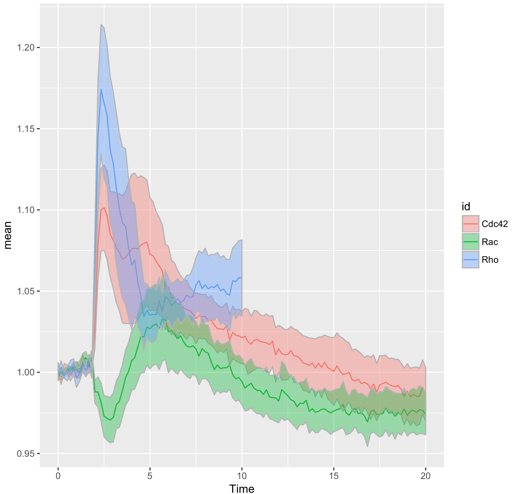
That’s all we need to make a graphical summary of the data:
>ggplot(df_tidy_mean, aes(x=Time, y=mean, color = id)) +
  geom_line(aes(x=Time, y=mean, color=id)) +
  geom_ribbon(aes(ymin=CI_lower,ymax=CI_upper,fill=id),color="grey70",alpha=0.4)
Improving the presentation and annotation of the graph
Further styling of the figure can be done. Below, we get rid of the default ggplot2 theme, change the scale of the x-axis and add a vertical line at t=1.75 to indicate when the stimulation took place. This will generate the final figure that was shown above:
>ggplot(df_tidy_mean, aes(x=Time, y=mean, color = id))+
  geom_line(aes(x=Time, y=mean, color=id))+
  geom_ribbon(aes(ymin=CI_lower,ymax=CI_upper,fill=id),color="grey",alpha=0.4)+
  theme_light(base_size = 16) + xlim(0,10) + geom_vline(xintercept = 1.75)
Color
User defined colors can be added to the lines and ribbons by using the functions scale_color_manual() and scale_fill_manual() respectively. The list of color values can consist of colornames or hexadecimal RGB code:
>color_list <- c("#EE6677", "#228833", "#4477AA")
Or:
>color_list <- c("darkgoldenrod", "limegreen", "turquoise2")
When the colors are defined, they can be used for plotting:
>ggplot(df_tidy_mean, aes(x=Time, y=mean, color = id))+
  geom_line(aes(x=Time, y=mean, color=id), size=1)+
  geom_ribbon(aes(ymin=CI_lower,ymax=CI_upper,fill=id),color="grey",alpha=0.4) +
  theme_light(base_size = 16) + xlim(0,10) + geom_vline(xintercept = 1.75) +
  scale_fill_manual(values=color_list) + scale_color_manual(values=color_list)
Side-by-side
Thus far, we made a single graph for all the data. To see the data from the different conditions (“id”) in separate plots, we add “facet_grid(.~id)”:
>ggplot(df_tidy_mean, aes(x=Time, y=mean, color = id))+
  geom_line(aes(x=Time, y=mean, color=id), size=1)+
  geom_ribbon(aes(ymin=CI_lower,ymax=CI_upper,fill=id),color="grey",alpha=0.4) +  theme_light(base_size = 16) + xlim(0,10) + geom_vline(xintercept = 1.75) +
  scale_fill_manual(values=color_list) + scale_color_manual(values=color_list) +
  facet_grid(.~id)
The result is three plots next to each other (in a horizontal format). However, in this case it probably makes more sense to arrange the plot in a single column. This is achieved by adjusting the order between the brackets: facet_grid(id~.). Since a legend seems redundant, it is removed in the following example:
>ggplot(df_tidy_mean, aes(x=Time, y=mean, color = id))+
  geom_line(aes(x=Time, y=mean, color=id), size=1)+
  geom_ribbon(aes(ymin=CI_lower,ymax=CI_upper,fill=id),color="grey",alpha=0.4) +  theme_light(base_size = 16) + xlim(0,10) + geom_vline(xintercept = 1.75) +
  scale_fill_manual(values=color_list) + scale_color_manual(values=color_list) +
  facet_grid(id~.)+ theme(legend.position="none")

Final words
The use of transparent layers for the different conditions allows to combine the data in a single graph. The resulting plot provides a clear view of the relation between the activities. Alternatively, the plots can be readily shown as a column in which the time axes are aligned (similar to the original figure 3 from Reinhard et al., 2017). I hope that providing this ‘walk-through’ that shows how to build a graph from multiple datasets will be a good starting point to generate plots of your own data with R/ggplot2.
Acknowledgments: Thanks to Eike Mahlandt and Max Grönloh for testing and debugging the code.
Footnotes
Footnote 1: The R packages that are necessary for this walk-through are: ‘dplyr’, ‘tidyr’, ‘ggplot2’ and ‘magrittr’. To load a package (after downloading and installing it) use require(), for example:
>require('dplyr')
The aforementioned packages are part of the ‘tidyverse’ and can be installed all at once.
Footnote 2: I usually mix basic R functions with functions from tidytools. This is mostly for ‘historical’ reasons; I first learned a bit of base R before I learned about the tidyverse. In my experience, some of the base R code is easier to remember and therefore my default code is base R. On the other hand, the tidy tools allow to string a number of functions together (using the pipe; %>%) which condenses the code, while maintaining readability.
Footnote 3: There are many places where the application of tidy tools is explained in more detail, for example here and here.
 (9 votes)
Get involved
Create an account or log in to post your story on the Node.
Sign up for emails
Subscribe to our mailing lists.
Read the latest Development issue
Most-read posts in June
- From Posters to Parades: Inside Woodstock.Bio² & Night Science Conference by Natanella Eliaz
- Visualizing with Vibes: Potential and Pitfalls by Joachim Goedhart
- Cellular Worlds – An Art Exhibition Inspired by Microscopic Universes
- On the Shape of Life: meeting report, SFBD meeting 2025 by Girish Kale
- #DanioDigest (May 2025) by Kevin Thiessen
- Squishing jellies!! by Yamini Ravichandran
- Lab meeting with the Silveira Lab
- SciArt profile: Henning Falk