On Growth and Form at 100: The story behind the cover
Posted by the Node Interviews, on 28 November 2017
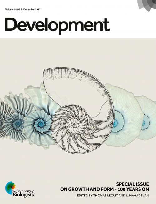
Today marks the publication of Development’s special issue celebrating the centenary of D’Arcy Thompson’s ‘On Growth and Form’. Given the continuing influence of the book’s graphical elements – from its captivating transformation diagrams to its drawings of geometrically stunning invertebrate shells – the Development team knew that the cover of the issue had to reflect this visual influence. A standard cover – for instance, a confocal image of an embryo – might not have been suitable. Luckily, as the Development team were discussing possible options, Mukul Tewary, first author of one of the papers featured in the issue, got in touch to let us know about the artistic and graphical talents of a graduate student in the Zandstra lab, Jen Ma. A look at some of her work led the Development team to commission her to design the cover for us, and in another piece of luck, Jen was able to involve Matthew Spremulli, a researcher with a background in architecture, in the project.
We caught up with Jen and Matthew to hear about the cover’s conception, design and completion.

Jen, can you tell us a little about your scientific background?
JM I am currently doing my PhD in Dr. Peter Zandstra’s Stem Cell Bioengineering Lab at the University of Toronto. It has been an eye-opening experience being in a such a diverse group, where our interests span from cell fate acquisition to cell competition, with expertise in advanced techniques like computational modeling and micropatterning (both employed in the study by my colleagues Tewary et al. published in this special issue). My research focuses on developing a platform for rapid enumeration of rare hematopoietic stem cells based on mRNA signatures.
Have you always been artistically inclined?
JM Come to think of it, everyone in my immediate family are involved in the STEM fields professionally, but also deeply immersed in the arts! Although I never had any formal training, I have always enjoyed drawing and painting, photography, and graphic design. About a year ago, I picked up lettering and illustration as a hobby. Having a creative outlet helps me balance the busy grad school life and has brought many interesting opportunities. I share my work on social media (Instagram: @ItsLikePudding) and volunteer my skills whenever my friends allow me, which have led to many fruitful collaborations and commissions (including this cover illustration). I’m especially interested in combining my passion in science and art for science communication and outreach.
Some of Jen’s creative output. See her Instagram page for more
Matthew – what’s your background, and how did you come to be involved in the project?
MS I am an Architect by training having completed a Masters of Architecture (focusing on digital media, fabrication, and landscape) and a Hon.B.A. (specializing in architecture and fine-art history). However, I decided to professionally explore experimental/research activities rather than traditional licensed practice since graduating, in other words I have not constructed a building. Instead I have worked with various groups on projects that have required expertise in research, design and digital media. I was invited into this project by Jen who upon mentioning the special issue of “On Growth and Form” clearly peaked my interest since the book is so influential to my disciplinary training.
So you were familiar with the book before? And how influential is it in architecture?
MS Yes, I had heard of the book and actually own a copy (the 1971 abridged edition by John Tyler Bonner)! The publication (all editions) is very influential to the discipline, specifically to designers who are interested in structure, form-finding and form-making. There are a wide range of historically notable designers who were directly inspired by the text and illustrations such as Frei Otto and Buckminster Fuller. In the case of Buckminster Fuller you can look at the Montreal Biosphère (originally built as the American Pavilion of the World Expo ‘67 in Montreal) to see some resemblance to the Radiolarian Skeletons or Hexagonal Skeletons from Thompson. On a more broad level, within the last decade architecture (and many of the allied design disciplines) has been heavily influenced by what we informally call ‘parametric’ and ‘generative’ design. These notions imply that a designer can set-up underlying mathematical relationships between geometric features of an object. The resultant forms of these relationships – which are usually managed through software applications such as Rhinoceros-Grasshopper can resemble some of the diagrams and illustrations from Thompson’s book.
What about your experience of the book, Jen?
JM I was briefly introduced to On Growth and Form at a lab meeting a few years back, and borrowed the book from Matthew when I found out that he has a copy. I’m embarrassed to admit that it has been sitting at my desk and I never had a chance to study and appreciate the influence of the book until now. It was very interesting to learn that many familiar concepts like surface-area-to-volume ratio and the logarithmic spiral are studied in this classic, and that its influence is seen in areas outside of developmental biology such as architecture. I actually visited the Montreal Biosphère earlier this month when I was in town for a conference based on Matthew’s recommendation!
Once Development had approached you about the project, what were your initial thoughts?
JM & MS Inspired by On Growth and Form, we wanted to implement concepts of rule-based form development to create the cover illustration. We also wanted to highlight the important role of computational modelling in advancing our understanding of complex physical form in the field of developmental biology. Graphic-wise, we thought it was important to have a strong reference to the iconic and beautifully hand drawn illustrations from the book. The idea was to take one of the specific images as a departure point to develop our own interpretative graphics that were going to be clearly ‘contemporary’ and unapologetically ‘digital’. There was going to be a fusion between these two ideas – historical and projective – we just did not know how this would specifically turn out.
We wanted to highlight the important role of computational modelling in advancing our understanding of complex physical form in the field of developmental biology
I’m interested how the process worked exactly?
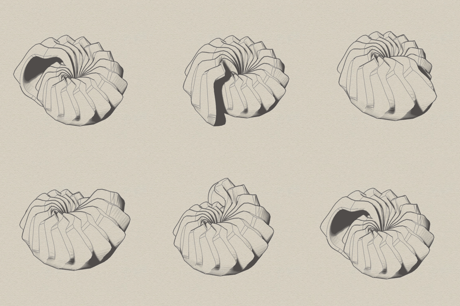
JM & MS A key to our ‘start’ was selecting one of the illustrations from the book that we wanted to work with. We debated between a few in particular – the Nautilus Shell, the Grid-Warped Fish, and the Radiolarian Skeletons. Ultimately we settled on the Nautilus Shell because we felt it was the most iconic and easily identified as being from the book. We then started sketching some layout options to integrate the biologically illustrated and digitally invented shells. The layouts provided us with a framework to move forward in our digital studies and, on a practical level, an estimation of how many digital forms we were going to make.
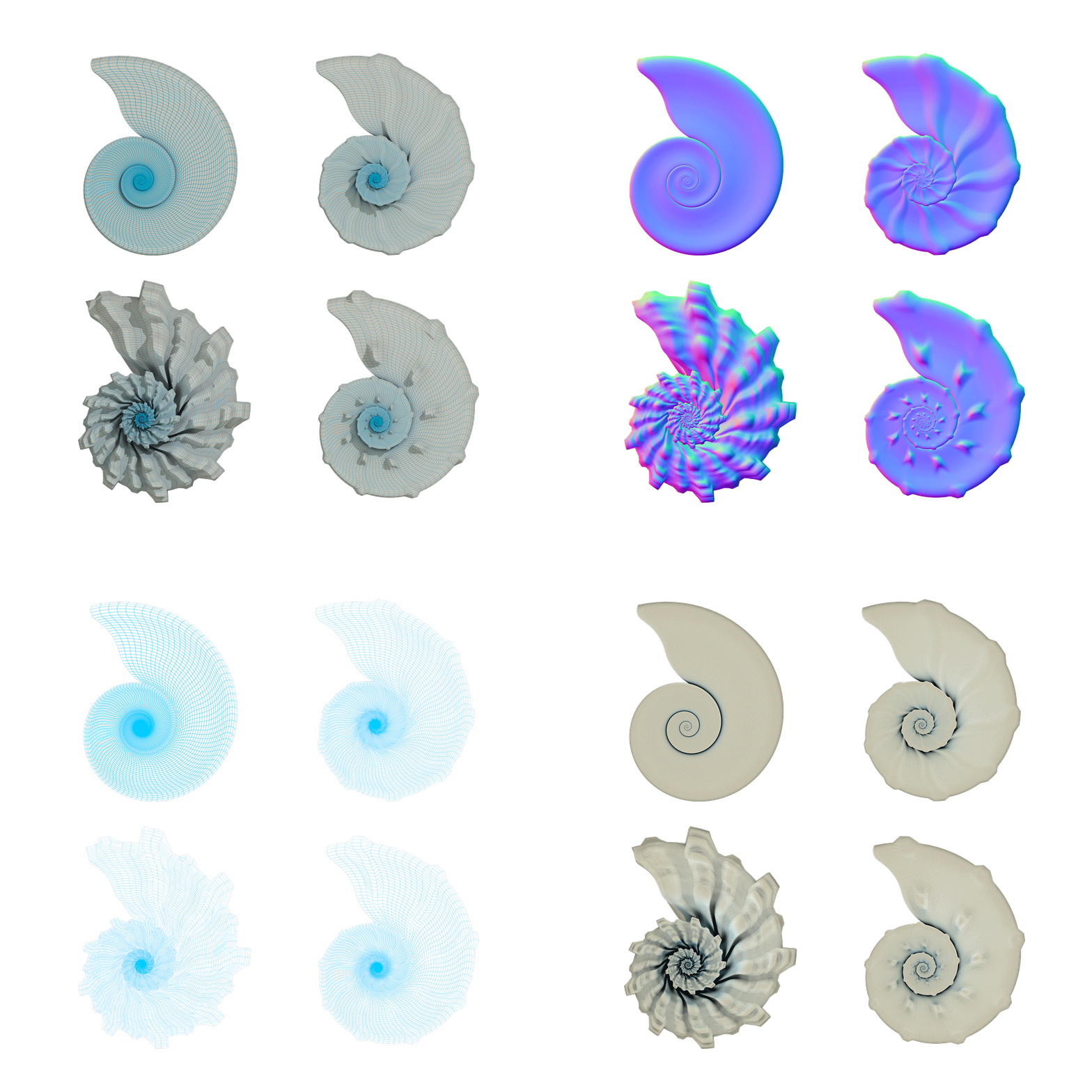
To digitally create our own shells, we sampled a number of scripts in Grasshopper, a visual programming plug-in for the Rhinoceros 3D design software, from various authors exploring spirals and shell type forms (big shout-out to the Grasshopper Forum and it’s amazing group of contributors and members). Ultimately, we cobbled together our own little Frankenstein-script, which could generate 3D structures that feature a logarithmic spiral and inner/outer profiles based on a few parameters and curves.

This allowed us to design an array of new shapes by experimenting with the parameters systematically. Each of the digital shells was then rendered to generate 2D images from the 3D models.We experimented with a number of rendering treatments which we then composited together in Photoshop to achieve the final shell images. This includes the mesh lines – the distinctive blue graphics you see on the cover – that visualize the framework the 3D forms were constructed based on.

The composited shells were then arranged to emulate the sketch layouts we made earlier.
And how did you settle on the final image?
JM & MS The layout was chosen for its incorporation of the concept of size and clean design. The shells on the left, while starkly different in terms of form and complexity, were created by tweaking just one parameter of the model. The shells on the right, on the other hand, share the same spiral structure but different profiles to create various forms. This demonstrates the power of the computational model to easily generate new structures. As for the renders, we implemented a textured finish and shading that’s different from stereotypical computer graphics to give the final image a unique look.
And ultimately, this combination received the most votes from the Development editors so the winner it is :)

Has the experience taught anything you about each other’s fields and the ways they work?
MS I think the experience taught me that scientists/engineers are very rigorous with their process … much more rigorous than designers. I was deeply influenced by the way in which Jen wanted to conduct the creation of the shells and their categorization. It also taught me to be a lot more clear and careful with my language and descriptions of design processes. To be honest I am still recovering from what we call in our industry “archi-speak”, which constitutes a number of words and phrases that designers use amongst each other, but which I realized are difficult for others to understand.
JM While there are some differences due to our backgrounds and personalities, we also share many commonalities in our approaches, which made the process quite smooth and fun! I think Matthew and I both appreciate designs that are aesthetically pleasing, but share the sentiment that developing a concept and representing it through compelling visuals is a more exciting challenge. We are both very open to experimenting with different media and methods, and enjoy the process of evolving our ideas through iterations. Implementing these approaches in the context of 3D modelling is outside of my expertise (my experience is limited to creating simple microfluidic devices and modelling a pineapple once) but well within Matthew’s, and it’s a pleasure to watch him work his magic. Learning parametric design and visual scripting from Matthew and seeing firsthand how he set up the digital framework also means I got a private lesson from one of the best teachers on the subject!
Where next for you both?
MS Over the years I have been moving more into the realm of digital media and research, and in fact I have just recently joined Autodesk (technology and software company). I will be working within one of their Research groups where I will have the opportunity to further explore my interests. I will also continue teaching digital media within the department of Landscape Architecture at the University of Toronto.
JM I’m working on wrapping up my thesis, and exploring opportunities in both research and science communication/illustration. I have also taken an interest in data visualization more recently, which may also allow me to combine my interest in graphics, communication, and science.
On Growth and Form at 100 on the Node:
An interview with Matthew Jarron
Morphogenesis one century after On Growth and Form


 (4 votes)