Dynamic display of data with animated plots
Posted by Joachim Goedhart, on 27 April 2020
Data from time-lapse experiments is often displayed in a graph or plot, to visualize the dynamics of biological systems (Goedhart, 2020). Ironically, the perception of the dynamics is largely lost in a static plot. That’s where animated plots come in. Animated plots are a great way to display the dynamics of the underlying data. Below, I provide a walk-through for creating an animated time series using R in Rstudio (footnote 1). The final result looks like this:
Static plot
The basis for the animation is a static plot. So I start with a brief explanation of how to generate a plot from time-series data (a more detailed explanation of plotting timeseries data can be found in a previous blog). First we load the ggplot2 package that is used for plotting:
>require(ggplot2)
Next, we can read the file, which contains the data in a ‘tidy’ format (to transform your own wide, spreadsheet data into tidy format see this blog) and assign it to the dataframe df_tidy:
>df_tidy <- read.csv("https://raw.githubusercontent.com/JoachimGoedhart/Animate-Labeled-TimeSeries/master/FRET-ratio-tidy.csv")
We can generate an ordinary line plot from the dataframe df_tidy:
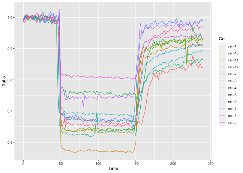
>ggplot(df_tidy, aes(x=Time, y=Ratio, color=Cell)) + geom_line()
This is the result:
Adding dynamics
Animated plots can be generated with the gganimate package and we will be using functions from the magick package for saving GIFs and so both are loaded:
>require(gganimate)
>require(magick)
To turn the static plot into an animated plot, we add the function transition_reveal(Time) to reveal the data over time:
>ggplot(df_tidy, aes(x=Time, y=Ratio, color=Cell)) + geom_line() +
  transition_reveal(Time)
Running this command may take some time (at least a minute on my MacBook). Once it’s ready, the animation is shown in the Viewer panel in RStudio. We will discuss how to save the animation in a bit. But first we will beautify the animation by adding a vertical line that runs along:
>ggplot(df_tidy, aes(x=Time, y=Ratio, color=Cell)) + geom_line() +
  geom_vline(aes(xintercept = Time)) + transition_reveal(Time)
Another option is to add a dot instead of a line to the leading edge to indicate the time:
>ggplot(df_tidy, aes(x=Time, y=Ratio, color=Cell)) + geom_line() +
  geom_point(size=2) + transition_reveal(Time)
To save the animation, we first store it as a new object called animated_plot:
>animated_plot <- ggplot(df_tidy, aes(x=Time, y=Ratio, color=Cell)) +
  geom_line() + geom_point(size=2) + transition_reveal(Time)
One of the advantages of this step is that we can do some styling of this object. For instance, changing the default R/ggplot2 layout to a more neutral look:
>animated_plot <- animated_plot + theme_light(base_size = 16)
Remove the grid:
> animated_plot <- animated_plot + theme(panel.grid.major = element_blank(), panel.grid.minor = element_blank())
Remove the legend:
> animated_plot <- animated_plot + theme(legend.position="none")
Now we can render the animation and assign it to the object animation. The number of frames in the animation can be specified and it makes sense to use the number of time-points (footnote 2).
>animation <- animate(animated_plot, nframes=70, renderer=magick_renderer())
The animation can be displayed in the Viewer panel in RStudio by entering its name in the command line:
>animation
To save the animation as a GIF in the working directory, run:
>image_write_gif(animation, 'animation.gif')
This is the resulting GIF with the animation:
Finally, moving labels can be added to the animation:
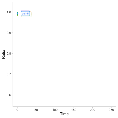
>animated_plot <- animated_plot + geom_label(aes(x = Time, y=Ratio, label=Cell), nudge_x = 10, size=4, hjust=0)
This needs to be rendered again before it can be displayed or saved:
>animation <- animate(animated_plot, nframes=70, renderer=magick_renderer())
Saving this as a GIF will give the animation that is shown at the start of this blog.
Final words
I like the animated plot as it elegantly displays the dynamics of the data. The animated plot can be combined with a movie of the process. But that will be a topic for a next blog…
A Shout-out to: Thomas Lin Pedersen who is the driving force behind the wonderful gganimate package. The code that was used here is based on this example: https://github.com/thomasp85/gganimate/wiki/Temperature-time-series
Footnotes
Footnote 1: If you are familiar with R you may skip the tutorial and try this R-script: https://github.com/JoachimGoedhart/Animate-Labeled-TimeSeries
Footnote 2: The default for generating high-quality GIFs is the Gifski renderer, but I had some issues with the rendering. To use the default type and save enter:
>animate(animated_plot, 70, renderer = gifski_renderer("animation.gif"))
 (7 votes)
Get involved
Create an account or log in to post your story on the Node.
Sign up for emails
Subscribe to our mailing lists.